Access International, s.r.o.
The ExplorerServes Businesses in Czech and Slovak Republics
What Drives Them
Pushes boundaries. Seeks new frontiers and experiences.
Color Intelligence
Access International, s.r.o. anchors on a vivid Orange (#fd6005) as their primary brand signal, paired with Blue (#0f128b), and accented by Purple. The palette leans cool — projecting trust and professionalism.
#fd6005
Primary
#0f128b
Secondary
#523f80
Accent
#26354a
Accent
#adb7c4
Accent
#f0c406
Accent
Typography
Headings set in Roboto Slab (a slab serif — bold and impactful, blending tradition with modern punch), body in Roboto (a sans-serif — clean, modern, and optimized for digital).
Logo Anatomy
Access International, s.r.o. uses a combination mark — pairing symbol with wordmark for versatility.
Combination Mark
Icon + Text
Brand Character
Access International, s.r.o. is formal and professional, authoritative and decisive.
third
college
formal
Signature Words
Design Playbook
natural
full_color
flat
horizontal
rounded
loose
image
Digital Footprint
Built on WordPress.
Market Presence
Regional presence, headquartered in Prague, CZ, communicating in 2 languages.
CZ
Prague, CZ
regional
cs, en
Access International, s.r.o. is a trademark of its respective owner. Bivernado is not affiliated with, endorsed by, or sponsored by Access International, s.r.o.. All brand data shown here is collected from publicly available sources and analyzed for informational and research purposes under fair use principles. Request removal →
Logo Variants
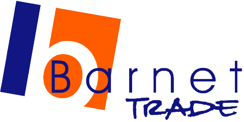
Primary Raster
Primary LogoBrand Codes
Bright Orange
Used in the logo and website elements to convey energy and innovation.
Roboto Slab
Used for headings, providing a modern and professional look.
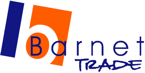
Abstract B shape
The logo features an abstract shape resembling the letter 'B' formed by a blue rectangle and an orange square with a semi-circle cut out.
More brands in Business Consulting
Explore other brands in this industry to compare visual identities.