ALMIR spedition s.r.o.
The RulerServes Businesses requiring container transport and logistics services
What Drives Them
Organized and dependable. Creates order and stability.
Given the emphasis on precision, safety, responsibility, and a reliable personality, coupled with a confident and technical voice, ALMIR's core positioning centers around providing dependable and trustworthy transportation and logistics services. The focus on BDF containers and related services further reinforces this operational reliability.
Color Intelligence
ALMIR spedition s.r.o. anchors on Blue (#0e716d) as their primary brand signal, paired with Green (#668f77), and accented by Blue. The palette leans cool — projecting trust and professionalism.
#0e716d
Primary
#668f77
Secondary
#98d5e5
Accent
#32a1c0
Accent
#cbc29d
Accent
#fdfefd
Background
Typography
Logo Anatomy
ALMIR spedition s.r.o. uses a combination mark — pairing symbol with wordmark for versatility.
Combination Mark
Icon + Text
Brand Character
ALMIR spedition s.r.o. is formal and professional, authoritative and decisive.
third
high_school
direct
Signature Words
Design Playbook
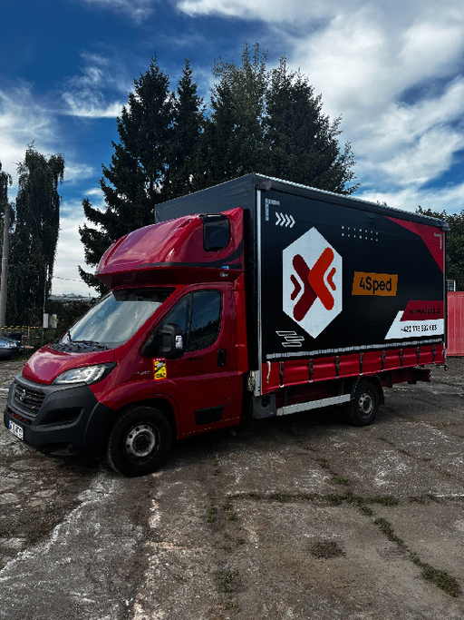
Industrial, Action shots of containers and trucks
natural
full_color
flat
horizontal
rounded
moderate
image
Digital Footprint
Built on WordPress.
Market Presence
Nationwide presence, headquartered in Prague, CZ.
CZ
Prague, CZ
national
cs
ALMIR spedition s.r.o. is a trademark of its respective owner. Bivernado is not affiliated with, endorsed by, or sponsored by ALMIR spedition s.r.o.. All brand data shown here is collected from publicly available sources and analyzed for informational and research purposes under fair use principles. Request removal →
Logo Variants
Primary Raster
Primary LogoBrand Codes
Founded in 2026
The website footer displays a copyright notice extending to 2026, suggesting a future-oriented perspective or a long-term commitment.
Green Accent
The color #2ecc71 is used for key elements like buttons and highlights, creating a sense of trust and efficiency.
Open Sans Body
The use of Open Sans for body text provides a clean and readable experience.
Miroslav Vítů
The website prominently features Miroslav Vítů (jednatel společnosti) as a key contact, suggesting a personal connection to the business.
Service Focus
The company name includes 'spedition', emphasizing their core service offering.
More brands in Logistics
Explore other brands in this industry to compare visual identities.