Auriga - Vlastimil Prachař
The EverymanServes Residents and businesses in Cerhenice, Cerhýnky, and Sokoleč
What Drives Them
Relatable and down-to-earth. Connects through belonging.
The brand emphasizes both reliability and speed in its values and personality. Combining these into 'Reliable Speediness' captures the core promise of dependable and fast internet and advertising services.
Color Intelligence
Auriga - Vlastimil Prachař anchors on Orange (#eae3d6) as their primary brand signal, paired with Orange (#f5a98a), and accented by Green. The palette leans warm — inviting and energetic.
#eae3d6
Primary
#f5a98a
Secondary
#9fb3ad
Accent
#4ec0b6
Accent
#fffefe
Background
#4f4f4f
Text
Typography
Headings set in Arial (a sans-serif — clean, modern, and optimized for digital), body in Tahoma (a sans-serif — clean, modern, and optimized for digital). 4 typeface families in play — a richer, more layered typographic system.
Logo Anatomy
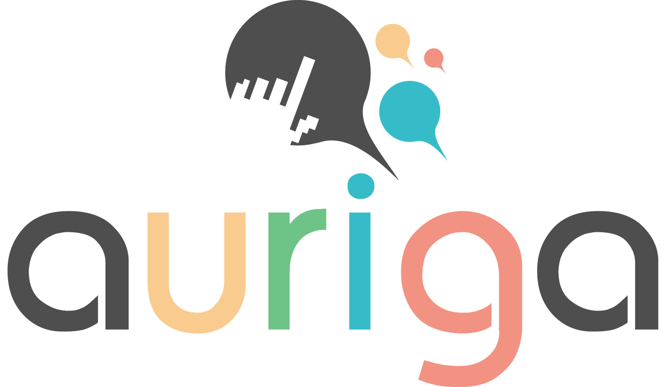
Auriga - Vlastimil Prachař uses a combination mark — pairing symbol with wordmark for versatility. Moderate detail — balancing distinctiveness with versatility. Style: modern, clean, dynamic.
Combination Mark
rectangle
Icon + Text
5/10
Brand Character
Auriga - Vlastimil Prachař is authoritative and decisive, warm and approachable, energetic and passionate — also technically detailed.
third
high_school
direct
Signature Words
Design Playbook
stock, business
natural
full_color
flat
horizontal
rounded
comfortable
image
Digital Footprint
Built on WordPress.
Market Presence
Local market, based in CZ.
CZ
local
cs
Auriga - Vlastimil Prachař is a trademark of its respective owner. Bivernado is not affiliated with, endorsed by, or sponsored by Auriga - Vlastimil Prachař. All brand data shown here is collected from publicly available sources and analyzed for informational and research purposes under fair use principles. Request removal →
Logo Variants
Primary Raster
Primary LogoPrimary shape: rectangle
Brand Codes
Peach
Used for accents and calls to action, creating a sense of warmth.
Tahoma
Used for headings and body text, providing a clean and readable feel.
Auriga logo
The logo features a stylized head with speech bubbles and the word "auriga" in a rounded sans-serif font with different colors for each letter.
More brands in Telecommunications
Explore other brands in this industry to compare visual identities.