Chalupa u Michálků
The InnocentServes Families with children
What Drives Them
Values simplicity and honesty. Trusted for being genuine.
The brand emphasizes family accommodation in the Šumava region. The values, personality, and keywords all point to a focus on providing a welcoming and comfortable experience for families, especially those with children.
Color Intelligence
Chalupa u Michálků anchors on Orange (#683b11) as their primary brand signal, paired with Yellow (#968e6b). The palette leans warm — inviting and energetic.
#683b11
Primary
#968e6b
Secondary
#83807e
Background
#605c5e
Background
#000000
Background
#cfcfc5
Background
Typography
Logo Anatomy
Chalupa u Michálků uses a combination mark — pairing symbol with wordmark for versatility.
Combination Mark
Icon + Text
Brand Character
Chalupa u Michálků is warm and approachable, energetic and passionate, simply spoken and accessible.
third
middle_school
direct
Signature Words
Design Playbook
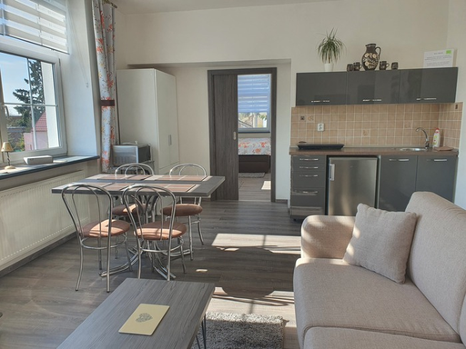
Nature, Exterior shots of the chalet, Interior shots of the rooms
natural
realistic
top
rounded
comfortable
image
Digital Footprint
Built on Bootstrap.
Market Presence
Local market, based in CZ.
CZ
local
cs
Chalupa u Michálků is a trademark of its respective owner. Bivernado is not affiliated with, endorsed by, or sponsored by Chalupa u Michálků. All brand data shown here is collected from publicly available sources and analyzed for informational and research purposes under fair use principles. Request removal →
Logo Variants
Primary SVG
Primary LogoBrand Codes
Rural Setting
The chalet is located in a rural setting near the Šumava National Park, emphasizing a connection to nature and traditional Czech countryside.
Šumava Region
The brand emphasizes its location in the Šumava region, a well-known area in the Czech Republic, leveraging its cultural and natural appeal.
Michálek Family
The name 'U Michálků' suggests a family-run establishment, potentially highlighting a personal connection and hospitality.
Rustic Red
The color #cd0a0a is used for key elements, suggesting a rustic and traditional aesthetic.
House Icon
A stylized house icon is used in the logo, representing the 'Chalupa' (cottage) and suggesting accommodation.
More brands in Travel & Tourism
Explore other brands in this industry to compare visual identities.