ČKD Blansko SMALL HYDRO, s.r.o.
The CreatorServes Hydropower plant operators
What Drives Them
Brings ideas to life. Values imagination and self-expression.
ČKD Blansko SMALL HYDRO positions itself as a highly knowledgeable and capable provider of hydro power solutions, emphasizing its expertise in turbines, valves, modernizations, and overhauls, backed by a long history and research facilities.
Color Intelligence
ČKD Blansko SMALL HYDRO, s.r.o. anchors on Blue (#afc0d4) as their primary brand signal, paired with Blue (#103b76), and accented by Blue. The palette leans cool — projecting trust and professionalism.
#afc0d4
Primary
#103b76
Secondary
#6a89ae
Accent
#19528d
Accent
#1f65a4
Accent
#f8fafb
Background
Typography
ČKD Blansko SMALL HYDRO, s.r.o. uses Titillium Web across both headings and body — a sans-serif — clean, modern, and optimized for digital. 3 typeface families in play — a richer, more layered typographic system.
Logo Anatomy
ČKD Blansko SMALL HYDRO, s.r.o. uses a combination mark — pairing symbol with wordmark for versatility.
Combination Mark
Icon + Text
Brand Character
ČKD Blansko SMALL HYDRO, s.r.o. is formal and professional, authoritative and decisive, technically detailed.
third
high_school
direct
Signature Words
Design Playbook
Industrial, Technical
natural
full_color
flat
horizontal
rounded
comfortable
image
Digital Footprint
Built on Joomla, active on 2 social platforms.
Market Presence
multinational, headquartered in Blansko, CZ, communicating in 2 languages.
CZ
Blansko, CZ
multinational
en, cs
ČKD Blansko SMALL HYDRO, s.r.o. is a trademark of its respective owner. Bivernado is not affiliated with, endorsed by, or sponsored by ČKD Blansko SMALL HYDRO, s.r.o.. All brand data shown here is collected from publicly available sources and analyzed for informational and research purposes under fair use principles. Request removal →
Logo Variants
Primary Raster
Primary LogoBrand Codes
ČKD Legacy
References to ČKD Blansko's history and tradition in engineering.
ČKD Blue
Consistent use of a specific shade of blue (#00a8e6) in the logo, website elements, and branding.
Titillium Web
Use of Titillium Web font for headings, body text, and navigation.
Hydro Focus
Emphasis on 'Hydro' in product and service names, reflecting the company's specialization.
Czech Engineering
Implied association with Czech engineering tradition and quality.
CKD Logo Shape
The CKD logo features a stylized, rounded shape that resembles interlocking gears or turbine blades, suggesting engineering and power generation.
Hydro Power Plant Imagery
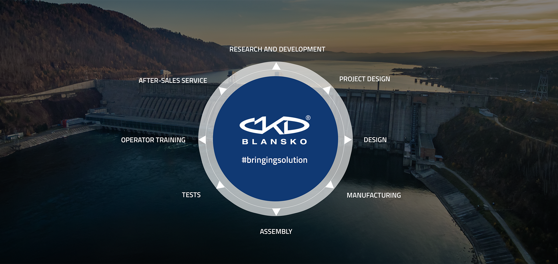
The website uses dramatic, high-quality photography of hydroelectric power plants and dams, often with dynamic water effects and scenic backdrops, to convey the company's focus on water-to-wire solutions.
Products & Business




More brands in Energy
Explore other brands in this industry to compare visual identities.