What Drives Them
Values simplicity and honesty. Trusted for being genuine.
Derwen's strong emphasis on traditional scouting values, heritage elements, and a nostalgic voice profile suggests a core positioning around traditionality. This is further supported by its community focus and youth development within a framework of established practices.
Color Intelligence
Derwen anchors on a muted Orange (#eeeae2) as their primary brand signal, paired with Red (#46322d), and accented by Orange. The palette leans warm — inviting and energetic.
#eeeae2
Primary
#46322d
Secondary
#725344
Accent
#b4ae98
Accent
#d0bdb2
Accent
#13121d
Text
Typography
Logo Anatomy
Derwen uses a combination mark — pairing symbol with wordmark for versatility.
Combination Mark
Icon + Text
Brand Character
Derwen is authoritative and decisive, warm and approachable, simply spoken and accessible.
third
middle_school
direct
Design Playbook
Digital Footprint
.
Market Presence
Local market, headquartered in Prague, CZ.
CZ
Prague, CZ
local
cs
Derwen is a trademark of its respective owner. Bivernado is not affiliated with, endorsed by, or sponsored by Derwen. All brand data shown here is collected from publicly available sources and analyzed for informational and research purposes under fair use principles. Request removal →
Logo Variants
Primary Raster
Primary LogoBrand Codes
Scouting Symbolism
Use of scouting symbols and imagery.
Traditional Scouting Values
Emphasis on traditional scouting values and activities.
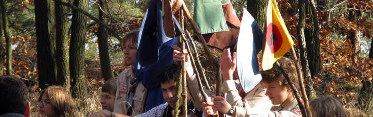
Outdoor Action Shots
The images feature candid, outdoor action shots of scouts participating in activities, suggesting a focus on real-life experiences and adventure.
More brands in Community Organization
Explore other brands in this industry to compare visual identities.