Ski Drahnik
Serves Families and couples seeking accommodation near ski resorts in Krkonoše.
What Drives Them
The brand emphasizes comfort, a family-friendly personality, and a rustic feel, all pointing towards a core concept of providing a welcoming and familiar environment for families seeking a comfortable and accessible ski experience. The website excerpt also highlights direct contact information, reinforcing a sense of approachability and personal service.
Color Intelligence
Ski Drahnik anchors on Blue (#2e5384) as their primary brand signal, paired with Blue (#96b6d6), and accented by Orange. The palette leans cool — projecting trust and professionalism.
#2e5384
Primary
#96b6d6
Secondary
#897062
Accent
#393c41
Text
#d8dada
Background
#202327
Background
Typography
Logo Anatomy
Brand Character
Design Playbook
Digital Footprint
Built on WordPress, active on 1 social platform.
Market Presence
Nationwide presence, based in CZ.
CZ
national
cs
Ski Drahnik is a trademark of its respective owner. Bivernado is not affiliated with, endorsed by, or sponsored by Ski Drahnik. All brand data shown here is collected from publicly available sources and analyzed for informational and research purposes under fair use principles. Request removal →
Products & Business
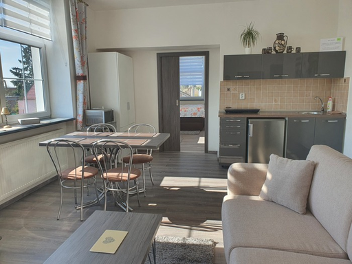
Apartmán 1
Apartmán 2
Ski Equipment Rental
More brands in Travel & Tourism
Explore other brands in this industry to compare visual identities.