ENERGOFOREST s.r.o.
The InnocentServes Local construction companies and woodworking businesses
What Drives Them
Values simplicity and honesty. Trusted for being genuine.
ENERGOFOREST emphasizes its regional origin, local economy support, and traditional practices. The brand's identity is deeply intertwined with its location and heritage, making 'Local-rootedness' its core differentiator.
Color Intelligence
ENERGOFOREST s.r.o. anchors on a vivid Green (#034621) as their primary brand signal, paired with Green (#0a602f), and accented by Green. The palette leans cool — projecting trust and professionalism.
#034621
Primary
#0a602f
Secondary
#70755b
Accent
#43472f
Accent
#8ea086
Accent
#3c644b
Accent
Typography
Logo Anatomy
Brand Character
ENERGOFOREST s.r.o. is formal and professional, authoritative and decisive.
third
high_school
direct
Signature Words
Design Playbook
product shots, natural light
natural
full_color
flat
horizontal
rounded
comfortable
image
Digital Footprint
Built on Bootstrap, active on 1 social platform.
Market Presence
Local market, headquartered in Křemže, CZ.
CZ
Křemže, CZ
local
cs
ENERGOFOREST s.r.o. is a trademark of its respective owner. Bivernado is not affiliated with, endorsed by, or sponsored by ENERGOFOREST s.r.o.. All brand data shown here is collected from publicly available sources and analyzed for informational and research purposes under fair use principles. Request removal →
Brand Codes
Regional Origin
The company emphasizes its location in Křemže and its connection to the local forestry industry.
Location-Based Naming
The company name 'ENERGOFOREST' combines energy and forest, reflecting its focus on forestry and related activities.
Forest Green
The use of #23b574 (a shade of green) in buttons and accents evokes the forestry industry.
Czech Language
The website is primarily in Czech, reflecting its focus on the local Czech market.
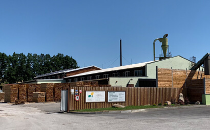
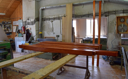
Products & Business
More brands in Forestry
Explore other brands in this industry to compare visual identities.