FRODO LIPNÍK s.r.o.
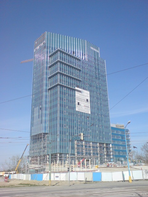
The Ruler“Stavby a kompletní rekonstrukce bytových objektů.”
What Drives Them
Organized and dependable. Creates order and stability.
Color Intelligence
FRODO LIPNÍK s.r.o. anchors on a vivid Blue (#00acc1) as their primary brand signal, paired with Gray (#222222). The palette leans warm — inviting and energetic.
#00acc1
Primary
#ffffff
Background
#000000
Text
#222222
Secondary
#666666
Text Alt
Typography
Headings set in Ribeye Marrow (a display face — designed for headlines and visual impact), body in Open Sans Flex (a sans-serif — clean, modern, and optimized for digital). 4 typeface families in play — a richer, more layered typographic system.
Logo Anatomy
FRODO LIPNÍK s.r.o. uses a combination mark — pairing symbol with wordmark for versatility.
Combination Mark
Icon + Text
Brand Character
FRODO LIPNÍK s.r.o. is authoritative and decisive, cool and detached.
third
high_school
direct
Signature Words
Design Playbook
Digital Footprint
Built on webnode.
Market Presence
Local market, headquartered in Lipník nad Bečvou, CZ.
CZ
Lipník nad Bečvou, CZ
local
cs
FRODO LIPNÍK s.r.o. is a trademark of its respective owner. Bivernado is not affiliated with, endorsed by, or sponsored by FRODO LIPNÍK s.r.o.. All brand data shown here is collected from publicly available sources and analyzed for informational and research purposes under fair use principles. Request removal →
Logo Variants
Primary Raster
Primary LogoBrand Codes
Cyan
#00acc1 used in the logo and as a primary color.
Open Sans Flex
Used for body text, providing a modern and readable style.
Unusual Name
The brand name is unusual and memorable.
More brands in Construction
Explore other brands in this industry to compare visual identities.