Hatle s.r.o.
The InnocentServes Farmers and agricultural businesses
What Drives Them
Values simplicity and honesty. Trusted for being genuine.
Hatle s.r.o. emphasizes its long-standing partnerships with established brands like JCB and Krone, its heritage, and its focus on service. This, combined with its professional and experienced personality, points to a core positioning of reliability in providing and servicing agricultural equipment.
Color Intelligence
Hatle s.r.o. anchors on a muted Blue (#404953) as their primary brand signal, paired with Green (#47ab66), and accented by Blue. The palette balances warm and cool tones.
#404953
Primary
#47ab66
Secondary
#9dcbd3
Accent
#fdfdfb
Background
#f5e057
Accent
#c19055
Accent
Typography
Headings set in Manrope (a sans-serif — clean, modern, and optimized for digital), body in Montserrat (a sans-serif — clean, modern, and optimized for digital). 4 typeface families in play — a richer, more layered typographic system.
Logo Anatomy
Hatle s.r.o. uses a combination mark — pairing symbol with wordmark for versatility.
Combination Mark
Icon + Text
Brand Character
Hatle s.r.o. is authoritative and decisive, technically detailed.
first_plural
high_school
direct
Signature Words
Design Playbook
Product shots, Action shots, Outdoor
natural
full_color
flat
horizontal
rounded
comfortable
image_carousel
Digital Footprint
Built on WordPress.
Market Presence
Regional presence, headquartered in Hořice, CZ.
CZ
Hořice, CZ
regional
cs
Hatle s.r.o. is a trademark of its respective owner. Bivernado is not affiliated with, endorsed by, or sponsored by Hatle s.r.o.. All brand data shown here is collected from publicly available sources and analyzed for informational and research purposes under fair use principles. Request removal →
Logo Variants

Primary Raster
Primary LogoBrand Codes
Founding Year
References to the company's founding in 2001.
Burnt Sienna
The #d8613c color is used for key elements like buttons and accents.
Service Focus
Emphasis on 'prodej' (sales) and 'servis' (service) in website content.
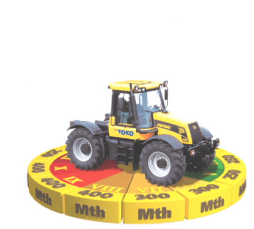
Tractor Imagery
Use of tractor imagery in the favicon and website graphics.
Manrope Sans-Serif
Use of Manrope font for headings.
Hatle s.r.o. font
The company name "Hatle s.r.o." is written in a bold, sans-serif font, often with a slight curve or arc beneath it.
Tractor photography
The tractors are photographed in a field, often at sunset or sunrise, creating a dramatic and professional image.
More brands in Agriculture
Explore other brands in this industry to compare visual identities.