What Drives Them
Puts people first. Builds trust through genuine care.
Given the emphasis on safety, verification, and the 'Důvěra a bezpečnost' tagline, along with the reliable and trustworthy personality, the core positioning revolves around providing a trustworthy platform for finding caregivers.
Color Intelligence
Hlídačky.cz anchors on a vivid Red (#a00000) as their primary brand signal, paired with Red (#fbd3d3). The palette leans warm — inviting and energetic.
#ffffff
Background
#4d5256
Background
#e5e3e4
Background
#bcc0be
Background
#a00000
Primary
#fbd3d3
Secondary
Typography
Primary typeface: Roboto. Single-font system — disciplined and consistent.
Logo Anatomy
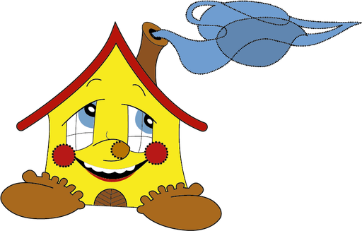
Hlídačky.cz uses a combination mark — pairing symbol with wordmark for versatility. Moderate detail — balancing distinctiveness with versatility. Style: modern, friendly, playful.
Combination Mark
circle
Icon + Text
5/10
Brand Character
Hlídačky.cz is authoritative and decisive, warm and approachable, energetic and passionate — also simply spoken and accessible.
first_plural
middle_school
direct
Signature Words
Design Playbook
candid, lifestyle
natural
bright
flat
top_navigation
rounded
comfortable
image_carousel
Digital Footprint
Built on Bootstrap, active on 5 social platforms.
Market Presence
Nationwide presence, based in CZ.
CZ
national
cs
Hlídačky.cz is a trademark of its respective owner. Bivernado is not affiliated with, endorsed by, or sponsored by Hlídačky.cz. All brand data shown here is collected from publicly available sources and analyzed for informational and research purposes under fair use principles. Request removal →
Logo Variants

Primary Raster
Primary LogoPrimary shape: circle
Brand Codes
Hlídáčky Pink
The brand uses a distinctive pink color (#f96073) consistently in its logo, buttons, and accents.
Roboto Headings
The brand uses Roboto for headings, creating a modern and readable feel.
Ověřené rodiči
The phrase 'Ověřené rodiči' (Verified by Parents) is used to emphasize the trustworthiness of the service.
Smiling Child Icon
The logo features a smiling child icon, representing the core service of childcare.
Map-Based Search
The website uses a map-based search interface to help users find childcare providers in their area.
Starry Moon
A crescent moon surrounded by stylized stars, used as a logo element.
More brands in Childcare
Explore other brands in this industry to compare visual identities.