Intalaterteam - Ondřej Bičiště
The RulerServes Homeowners and businesses in the Nymburk region
What Drives Them
Organized and dependable. Creates order and stability.
Color Intelligence
Intalaterteam - Ondřej Bičiště anchors on a vivid Blue (#0063ff) as their primary brand signal, paired with Blue (#1f2a38), and accented by Blue. The palette leans cool — projecting trust and professionalism.
#0063ff
Primary
#1f2a38
Secondary
#eff0f2
Accent
#0000ff
Accent
#960b11
Accent
#93918e
Accent
Typography
Headings set in Montserrat (a sans-serif — clean, modern, and optimized for digital), body in Open Sans (a sans-serif — clean, modern, and optimized for digital). 3 typeface families in play — a richer, more layered typographic system.
Logo Anatomy
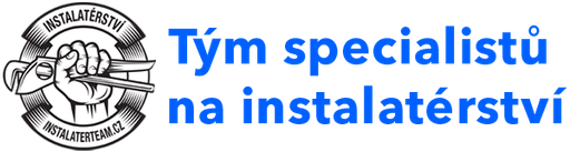
Intalaterteam - Ondřej Bičiště uses a combination mark — pairing symbol with wordmark for versatility. Moderate detail — balancing distinctiveness with versatility. Style: modern, clean, professional.
Combination Mark
rectangle
Icon + Text
5/10
Brand Character
Intalaterteam - Ondřej Bičiště is authoritative and decisive, technically detailed.
third
high_school
direct
Signature Words
Design Playbook
realistic, candid
natural
full_color
flat
horizontal
rounded
balanced
image
Digital Footprint
Built on WordPress.
Market Presence
Regional presence, headquartered in Nymburk, CZ.
CZ
Nymburk, CZ
regional
cs
Intalaterteam - Ondřej Bičiště is a trademark of its respective owner. Bivernado is not affiliated with, endorsed by, or sponsored by Intalaterteam - Ondřej Bičiště. All brand data shown here is collected from publicly available sources and analyzed for informational and research purposes under fair use principles. Request removal →
Logo Variants

Primary Raster
Primary LogoPrimary shape: rectangle
Brand Codes
0061ff
Bright blue used for calls to action and highlights, creating a sense of trust and reliability.
Montserrat
Used for headings, providing a modern and clean look.
Instalatér
Highlights the core service offered.
Plumber's Hand
A black and white illustration of a hand holding a pipe wrench, surrounded by a gear-like circle, is used as a logo.
More brands in Construction
Explore other brands in this industry to compare visual identities.


