Charita Jilemnice
The EverymanServes People in need of social, spiritual, or material assistance, including seniors, people with disabilities, families, and the homeless.
What Drives Them
Relatable and down-to-earth. Connects through belonging.
Posláním Charity Jilemnice je pomoc lidem v hmotné, sociální, duchovní a duševní nouzi bez ohledu na jejich příslušnost k rase, národnosti a náboženskému vyznání.
Color Intelligence
Charita Jilemnice anchors on a vivid Red (#b51401) as their primary brand signal, paired with Red (#bf3223), and accented by Red. The palette leans warm — inviting and energetic.
#b51401
Primary
#bf3223
Secondary
#cf0000
Accent
#ecc3bf
Accent
#d3756c
Accent
#093367
Accent
Typography
Headings set in minion-pro (a serif — evoking tradition, authority, and print heritage), body in Montserrat (a sans-serif — clean, modern, and optimized for digital). This serif/sans pairing creates classic typographic contrast.
Logo Anatomy
Charita Jilemnice uses a combination mark — pairing symbol with wordmark for versatility.
Combination Mark
Icon + Text
Brand Character
Design Playbook
Digital Footprint
.
Market Presence
Nationwide presence, based in CZ.
CZ
national
cs
Charita Jilemnice is a trademark of its respective owner. Bivernado is not affiliated with, endorsed by, or sponsored by Charita Jilemnice. All brand data shown here is collected from publicly available sources and analyzed for informational and research purposes under fair use principles. Request removal →
Logo Variants

Primary SVG
Primary LogoBrand Codes
Cross with Petals
A red cross with stylized petal-like shapes emanating from each arm, resembling a flower or sunburst.
Products & Business

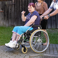



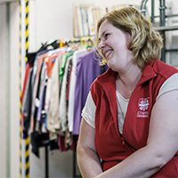
Charitní obchůdek (Charity Shop)
Charitní taxi (Charity Taxi)
Charitní šatník (Charity Clothing Bank)
Domácí hospicová péče (Home Hospice Care)
Domácí zdravotní péče (Home Health Care)
Hygienické zařízení (Hygiene Facilities)
Mateřské centrum Rodinka (Family Center)
Potravinová pomoc (Food Assistance)
Showing 8 of 9 products
More brands in social_services
Explore other brands in this industry to compare visual identities.