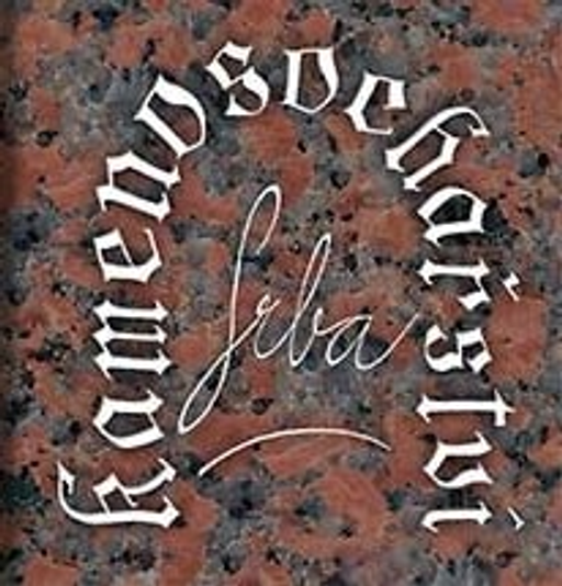
Kamenosochařství Srba
The InnocentServes Local residents and businesses in Vysoké Mýto and Ústí nad Orlicí seeking stonecutting services.
What Drives Them
Values simplicity and honesty. Trusted for being genuine.
The brand emphasizes its local service area (Vysoké Mýto, Ústí nad Orlicí), local craftsmanship, and location-based naming, suggesting a focus on being the trusted, nearby stone carver.
Color Intelligence
Kamenosochařství Srba anchors on a muted Red (#584643) as their primary brand signal, paired with Red (#785a53). The palette leans warm — inviting and energetic.
#584643
Primary
#785a53
Secondary
#dbd8d7
Background
#342b29
Background
#968b88
Background
#f7f7f7
Background
Typography
Headings set in Courgette (a handwritten style — projecting personality and human warmth), body in Noto Sans (a sans-serif — clean, modern, and optimized for digital). 3 typeface families in play — a richer, more layered typographic system.
Logo Anatomy
Kamenosochařství Srba uses a combination mark — pairing symbol with wordmark for versatility.
Combination Mark
Icon + Text
Brand Character
Kamenosochařství Srba is authoritative and decisive, warm and approachable.
first_plural
middle_school
direct
Signature Words
Design Playbook
product shots, outdoor
natural
full_color
flat
dropdown
rounded
comfortable
image
Digital Footprint
Built on WordPress.
Market Presence
Local market, headquartered in Vysoké Mýto, CZ.
CZ
Vysoké Mýto, CZ
local
cs
Kamenosochařství Srba is a trademark of its respective owner. Bivernado is not affiliated with, endorsed by, or sponsored by Kamenosochařství Srba. All brand data shown here is collected from publicly available sources and analyzed for informational and research purposes under fair use principles. Request removal →
Logo Variants
Primary Raster
Primary LogoBrand Codes
Tradition of Craftsmanship
Emphasis on traditional stonecutting techniques and long-standing expertise.
Czech Craftsmanship
Implies a connection to Czech traditions of craftsmanship and quality.
Location-Based Naming
The brand name includes the location (Vysoké Mýto), emphasizing local service.
Deep Blue
The use of deep blue (#020381) in the website design suggests reliability and professionalism.
More brands in Construction
Explore other brands in this industry to compare visual identities.


