KČT, odbor Rakovník
The Everyman“Klub českých turistů Rakovník”
Serves adults
What Drives Them
Relatable and down-to-earth. Connects through belonging.
KČT Rakovník, with its focus on hiking, tourism, and community, fosters a sense of connection to nature, to the local area, and to fellow enthusiasts. The club's activities and values all point towards building and strengthening these bonds.
Color Intelligence
KČT, odbor Rakovník anchors on Red (#701a1f) as their primary brand signal, paired with Red (#bd0710), and accented by Blue. The palette leans warm — inviting and energetic.
#701a1f
Primary
#bd0710
Secondary
#2c6583
Accent
#8b848b
Background
#bdbec1
Background
#fefefe
Background
Typography
Logo Anatomy
KČT, odbor Rakovník uses a combination mark — pairing symbol with wordmark for versatility.
Combination Mark
Icon + Text
Brand Character
Design Playbook
Digital Footprint
.
Market Presence
Nationwide presence, based in CZ.
CZ
national
cs
KČT, odbor Rakovník is a trademark of its respective owner. Bivernado is not affiliated with, endorsed by, or sponsored by KČT, odbor Rakovník. All brand data shown here is collected from publicly available sources and analyzed for informational and research purposes under fair use principles. Request removal →
Logo Variants
Primary Raster
Primary LogoBrand Codes
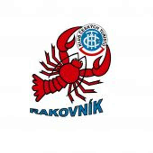
Lobster
A red lobster is used as a mascot.
RAKOVNÍK
The word RAKOVNÍK is written in a specific blue font.
KČT Logo
The KČT logo is a circle with blue and white stripes and a blue symbol in the center.
Products & Business
More brands in tourism
Explore other brands in this industry to compare visual identities.