Projekt ČIŘIKÁNÍ
The EverymanServes Farmers, hunters, conservationists, local communities in Czech Republic
What Drives Them
Relatable and down-to-earth. Connects through belonging.
The brand's core focus is on the conservation of the partridge and other field birds, achieved through research, community collaboration, and sustainable practices. This dedication to conservation is central to their identity.
Color Intelligence
Projekt ČIŘIKÁNÍ anchors on Blue (#96b3d6) as their primary brand signal, paired with Orange (#f2a15f), and accented by Blue. The palette leans cool — projecting trust and professionalism.
#96b3d6
Primary
#f2a15f
Secondary
#638dc0
Accent
#4873a8
Accent
#b2bb97
Accent
#556a26
Accent
Typography
Logo Anatomy
Projekt ČIŘIKÁNÍ uses a combination mark — pairing symbol with wordmark for versatility.
Combination Mark
Icon + Text
Brand Character
Design Playbook
Digital Footprint
.
Market Presence
Nationwide presence, based in CZ.
CZ
national
cs
Projekt ČIŘIKÁNÍ is a trademark of its respective owner. Bivernado is not affiliated with, endorsed by, or sponsored by Projekt ČIŘIKÁNÍ. All brand data shown here is collected from publicly available sources and analyzed for informational and research purposes under fair use principles. Request removal →
Logo Variants
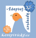
Primary Raster
Primary LogoBrand Codes
Cornflower bird
A stylized bird illustration with cornflower accents, used in the 'Adoptuj Koroptev' logo.
Products & Business
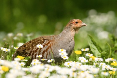
Adopt a Partridge campaign
Biodiversity studies
Ecological projects
Educational seminars
Guided excursions
More brands in Environment
Explore other brands in this industry to compare visual identities.