Klub přátel rozhleden
The EverymanServes Individuals interested in observation towers and scenic viewpoints
What Drives Them
Relatable and down-to-earth. Connects through belonging.
Color Intelligence
Klub přátel rozhleden anchors on a muted Green (#30382a) as their primary brand signal, paired with Blue (#75b6f4), and accented by Blue. The palette leans cool — projecting trust and professionalism.
#30382a
Primary
#75b6f4
Secondary
#bbccdb
Accent
#667839
Accent
#9cc2e5
Accent
#708188
Accent
Typography
Headings set in Sarala (a sans-serif — clean, modern, and optimized for digital), body in Droid Sans (a sans-serif — clean, modern, and optimized for digital). 3 typeface families in play — a richer, more layered typographic system.
Logo Anatomy
Klub přátel rozhleden uses a combination mark — pairing symbol with wordmark for versatility.
Combination Mark
Icon + Text
Brand Character
Klub přátel rozhleden is warm and approachable, simply spoken and accessible.
third
high_school
direct
Signature Words
Design Playbook
natural
natural
flat
horizontal
rounded
loose
static
Digital Footprint
Built on WordPress, active on 1 social platform.
Market Presence
Nationwide presence, headquartered in Prague, CZ.
CZ
Prague, CZ
national
cs
Klub přátel rozhleden is a trademark of its respective owner. Bivernado is not affiliated with, endorsed by, or sponsored by Klub přátel rozhleden. All brand data shown here is collected from publicly available sources and analyzed for informational and research purposes under fair use principles. Request removal →
Logo Variants
Primary Raster
Primary LogoBrand Codes
Droid Sans
Used for headings, providing a clean and readable look.
Klub přátel rozhleden
Clearly states the purpose of the club.
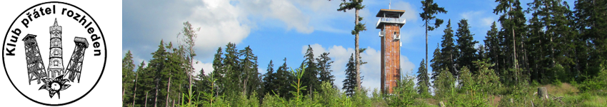
Tower Trio
A black and white illustration of three different observation towers is used as a logo.
Social Media Intelligence
More brands in Travel
Explore other brands in this industry to compare visual identities.