Krásenský pivovar, s.r.o.
The InnocentServes Local residents and tourists interested in traditional Czech beer and cuisine.
What Drives Them
Values simplicity and honesty. Trusted for being genuine.
Color Intelligence
Krásenský pivovar, s.r.o. anchors on Orange (#d5ac6a) as their primary brand signal, paired with Orange (#af8948), and accented by Gray. The palette leans warm — inviting and energetic.
#828386
Accent
#d5ac6a
Primary
#af8948
Secondary
#fffffe
Background
#000000
Background
#4b4d53
Accent
Typography
Headings set in slick (a sans-serif — clean, modern, and optimized for digital), body in Segoe UI (a sans-serif — clean, modern, and optimized for digital). 4 typeface families in play — a richer, more layered typographic system.
Logo Anatomy
Krásenský pivovar, s.r.o. uses a combination mark — pairing symbol with wordmark for versatility.
Combination Mark
Icon + Text
Brand Character
Krásenský pivovar, s.r.o. is authoritative and decisive, energetic and passionate.
third
high_school
direct
Signature Words
Design Playbook
Digital Footprint
.
Market Presence
Local market, headquartered in Valašské Meziříčí, CZ.
CZ
Valašské Meziříčí, CZ
local
cs
Krásenský pivovar, s.r.o. is a trademark of its respective owner. Bivernado is not affiliated with, endorsed by, or sponsored by Krásenský pivovar, s.r.o.. All brand data shown here is collected from publicly available sources and analyzed for informational and research purposes under fair use principles. Request removal →
Logo Variants

Primary Raster
Primary LogoBrand Codes
Gold
Used for accents and highlights, evoking the color of beer.
Segoe UI
Used for headings and body text, providing a modern and clean look.
Brewery Tradition
Implied through the branding and product offerings.
Krásenský Pivovar Logo
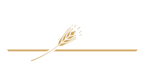
The logo features a bold, sans-serif typeface for 'KRÁSNENSKÝ PIVOVAR' with a stylized wheat stalk illustration integrated into the text.
Icon Style
The website uses simple, white line-art icons on a dark background to represent different sections like the brewery, beer, kitchen, and contact.
Krásenský Pivovar typeface
The logo uses a bold, sans-serif typeface with a slightly distressed or textured appearance, giving it a rustic and traditional feel.
Wheat stalk
The logo incorporates a stylized wheat stalk, symbolizing the brewing process and the use of grains in beer production.
More brands in Food & Beverage
Explore other brands in this industry to compare visual identities.

![0,75 [Sedmička] logo](/assets/075-cz/logo/512.png)

