Lékaři bez hranic
The Explorer“Lékařská pomoc tam, kde je nejvíce potřeba. Nezávislá. Neutrální. Nestranná.”
Serves Donors and Supporters
What Drives Them
Pushes boundaries. Seeks new frontiers and experiences.
Lékaři bez hranic emphasizes neutrality, independence, and impartiality in their mission. This commitment to providing aid without bias is a core differentiator and a key aspect of their brand identity.
Color Intelligence
Lékaři bez hranic anchors on a vivid Red (#ee0202) as their primary brand signal, paired with Red (#f12f2f), and accented by Red. The palette leans warm — inviting and energetic.
#ee0202
Primary
#f12f2f
Secondary
#f9a9a9
Accent
#ffffff
Background
#fcd1d1
Accent
#f67272
Accent
Typography
Headings set in Neue Haas Grotesk Text Pro (a sans-serif — clean, modern, and optimized for digital), body in Publico Text Web (a serif — evoking tradition, authority, and print heritage). This serif/sans pairing creates classic typographic contrast.
Logo Anatomy
Lékaři bez hranic uses a combination mark — pairing symbol with wordmark for versatility. Moderate detail — balancing distinctiveness with versatility. Style: global, humanitarian, medical.
Combination Mark
circle
Icon + Text
6/10
Brand Character
Lékaři bez hranic is authoritative and decisive, warm and approachable, energetic and passionate.
first_plural
high_school
direct
Signature Words
Design Playbook
documentary, candid
natural
realistic
flat
top_fixed
rounded
comfortable
image
Digital Footprint
Built on Drupal, active on 4 social platforms.
Market Presence
multinational, based in CZ, communicating in 2 languages.
CZ
multinational
cs, en
Lékaři bez hranic is a trademark of its respective owner. Bivernado is not affiliated with, endorsed by, or sponsored by Lékaři bez hranic. All brand data shown here is collected from publicly available sources and analyzed for informational and research purposes under fair use principles. Request removal →
Logo Variants
Primary Raster
Primary LogoPrimary shape: circle
Brand Codes
MSF
Médecins Sans Frontières is often referred to by its acronym, MSF.
Red Cross
The red cross symbol is used to represent medical aid and humanitarian assistance.
International Organization
References to the organization's long history and global presence.
Running Man
A red stick figure running across red horizontal lines, symbolizing aid and movement.
Documentary Style
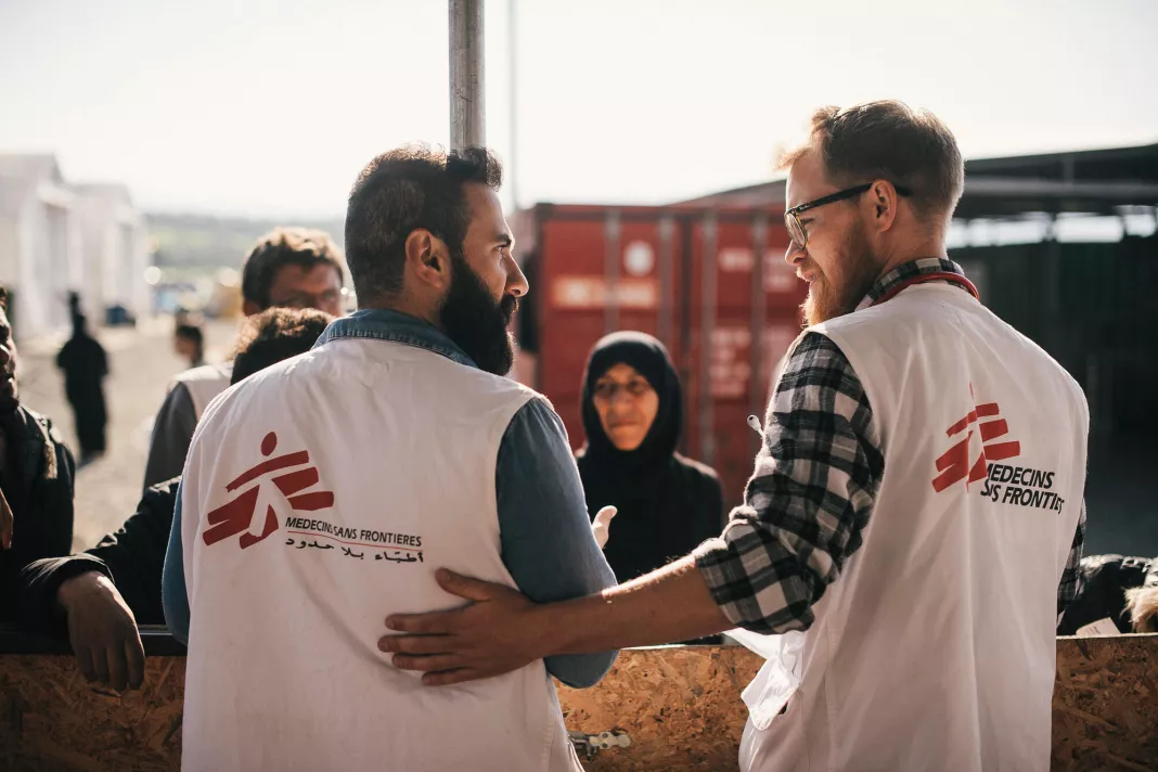
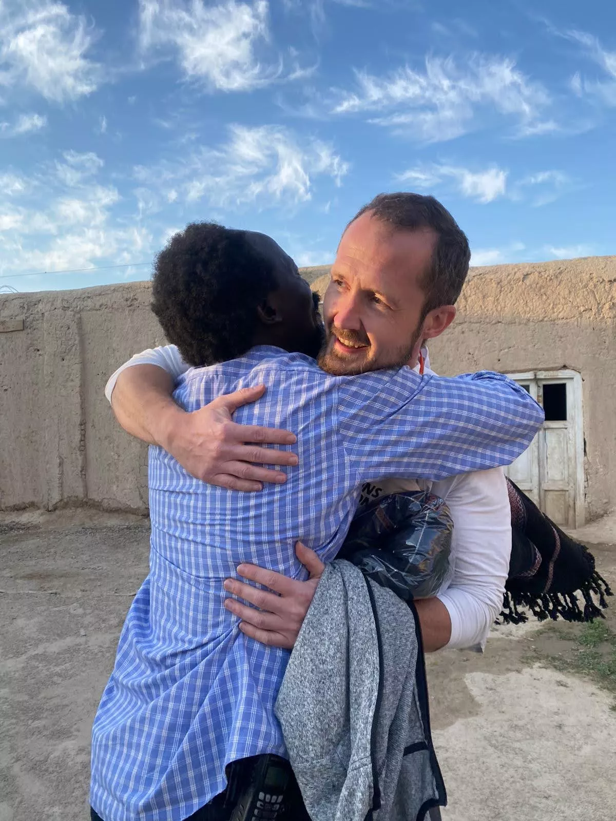
The photography style appears to be documentary, focusing on capturing real-life situations and people in need, often in natural settings.
Products & Business
More brands in Healthcare
Explore other brands in this industry to compare visual identities.




