What Drives Them
The stated values of 'spolehlivost' (reliability) and 'loajalita' (loyalty), combined with the need for dependable service in the 'Spedition' (freight forwarding) business, suggest that Lorenc Spedition aims to be known for its reliability.
Color Intelligence
Lorenc Spedition anchors on Red (#fbe2e2) as their primary brand signal, paired with Red (#e23737), and accented by Red. The palette leans warm — inviting and energetic.
#fbe2e2
Primary
#e23737
Secondary
#dd1212
Accent
#f19b9b
Accent
#e64f4f
Accent
#eb7575
Accent
Typography
3 typeface families in play — a richer, more layered typographic system.
Logo Anatomy
Lorenc Spedition uses a combination mark — pairing symbol with wordmark for versatility.
Combination Mark
Icon + Text
Brand Character
Design Playbook
Digital Footprint
.
Market Presence
Nationwide presence, based in US.
US
national
cs
Lorenc Spedition is a trademark of its respective owner. Bivernado is not affiliated with, endorsed by, or sponsored by Lorenc Spedition. All brand data shown here is collected from publicly available sources and analyzed for informational and research purposes under fair use principles. Request removal →
Logo Variants

Primary Raster
Primary LogoBrand Codes
Lorenc Spedition Logo Font
The Lorenc Spedition logo uses a bold, sans-serif font for 'LORENC' and 'INTERNATIONAL', with a more condensed, sans-serif font for 'spedition' within a rectangular box.
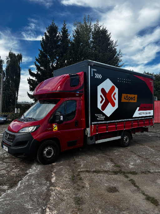
Truck on the Road
The website features a photography style that showcases their trucks in transit on scenic roads, often at dusk or dawn, emphasizing reliability and reach.
Products & Business
Fuel
Logistika
Silniční nákladní doprava
Skladování
Spedice
More brands in Logistics
Explore other brands in this industry to compare visual identities.