Apartmány Masarykova 30
The Ruler“Masarykova N°30”
Serves Affluent travelers seeking premium accommodation in Brno
What Drives Them
Commands authority and sets the standard for the category.
Color Intelligence
Apartmány Masarykova 30 anchors on a muted Blue (#a9b6bd) as their primary brand signal, paired with Blue (#d2d9dd). The palette leans cool — projecting trust and professionalism.
#a9b6bd
Primary
#d2d9dd
Secondary
#f0f3f4
Background
#6e7275
Background
#1b1b1c
Text
#5a5651
Background
Typography
Single-font system — disciplined and consistent.
Logo Anatomy
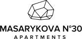
Apartmány Masarykova 30 uses a combination mark — pairing symbol with wordmark for versatility.
Combination Mark
Icon + Text
Brand Character
Apartmány Masarykova 30 is formal and professional, authoritative and decisive, cool and detached.
third
college
formal
Signature Words
Design Playbook
Digital Footprint
Built on WordPress.
Market Presence
Local market, headquartered in Brno, CZ, communicating in 2 languages.
CZ
Brno, CZ
local
en, cs
Apartmány Masarykova 30 is a trademark of its respective owner. Bivernado is not affiliated with, endorsed by, or sponsored by Apartmány Masarykova 30. All brand data shown here is collected from publicly available sources and analyzed for informational and research purposes under fair use principles. Request removal →
Logo Variants
Primary SVG
Primary LogoBrand Codes
Neutral Gray
Used as a background and accent color, creating a sophisticated feel.
Gopher
Elegant font used for headings, contributing to the boutique feel.
N°
Using 'N°' in the name and throughout the site to denote exclusivity.
Geometric Diamond
A geometric diamond shape is used as the logo.
More brands in Real Estate
Explore other brands in this industry to compare visual identities.