What Drives Them
Organized and dependable. Creates order and stability.
Color Intelligence
and accented by Gray. The palette balances warm and cool tones.
#fefefe
Background
#c1c1c1
Accent
#1e1e1e
Text
#2c2e30
Background
#949697
Accent
#47494b
Text
Typography
Headings set in Metropolis (a sans-serif — clean, modern, and optimized for digital), body in Open Sans Flex (a sans-serif — clean, modern, and optimized for digital). 3 typeface families in play — a richer, more layered typographic system.
Logo Anatomy
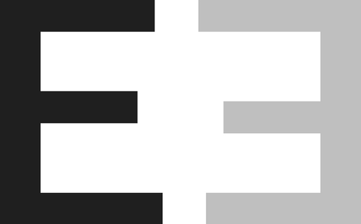
MISE, s.r.o. uses a wordmark — the brand name IS the logo, relying on typography alone. Minimal complexity — clean and scalable across all touchpoints. Style: clean, minimalist.
Wordmark
rectangle
Text
3/10
Brand Character
MISE, s.r.o. is formal and professional, authoritative and decisive, cool and detached.
third
high_school
formal
Signature Words
Design Playbook
architectural, daylight
natural
full_color
horizontal
rounded
loose
image
Digital Footprint
Built on webnode.
Market Presence
Local market, headquartered in Teplice, CZ.
CZ
Teplice, CZ
local
cs
MISE, s.r.o. is a trademark of its respective owner. Bivernado is not affiliated with, endorsed by, or sponsored by MISE, s.r.o.. All brand data shown here is collected from publicly available sources and analyzed for informational and research purposes under fair use principles. Request removal →
Logo Variants

Primary Raster
Primary LogoPrimary shape: rectangle
Brand Codes
Metropolis
Modern and geometric font used for headings, conveying a sense of precision and innovation.
MISE
Short, memorable name that suggests purpose and direction.
MISE logo
The logo features a stylized 'E' shape with a geometric design, using a combination of black, white, and gray tones.
Architectural Detail Focus
The photography style emphasizes close-up, detailed shots of architectural elements, particularly the building's facade and its unique metal screen design.
Architectural Detail
The photography style emphasizes close-up, detailed shots of architectural elements, particularly the building's facade and its unique metal screen design.
More brands in Architecture
Explore other brands in this industry to compare visual identities.