
What Drives Them
Color Intelligence
Hotel Miura anchors on Pink (#ae1382) as their primary brand signal, paired with Blue (#5c7078), and accented by Pink. The palette leans warm — inviting and energetic.
#ae1382
Primary
#5c7078
Secondary
#670e4e
Accent
#941570
Accent
#ffffff
Background
#4e4b48
Text
Typography
Single-font system — disciplined and consistent.
Logo Anatomy
Hotel Miura uses a combination mark — pairing symbol with wordmark for versatility.
Combination Mark
Icon + Text
Brand Character
Design Playbook
Digital Footprint
.
Market Presence
Nationwide presence, based in CZ, communicating in 2 languages.
CZ
national
cs, en
Hotel Miura is a trademark of its respective owner. Bivernado is not affiliated with, endorsed by, or sponsored by Hotel Miura. All brand data shown here is collected from publicly available sources and analyzed for informational and research purposes under fair use principles. Request removal →
Logo Variants

Primary Raster
Primary LogoBrand Codes
Pixelated Font
The logo uses a distinctive pixelated font, giving it a retro, digital aesthetic.
Architectural Focus
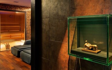
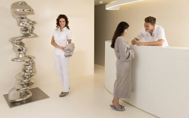
The photography emphasizes the hotel's modern architecture and surrounding landscape, using wide shots and natural lighting.
Products & Business


Deluxe Queen Room
Deluxe Twin Room
Dinner for Two Package
Junior Suite
Miura Deluxe Pro 2 Package
Miura SPA
Miura Suite
Perfect Relax for Two Package
Showing 8 of 9 products
More brands in Hospitality
Explore other brands in this industry to compare visual identities.

