Mléčná jídelna Astra v.o.s.
The InnocentServes Local residents seeking affordable meals and snacks
What Drives Them
Values simplicity and honesty. Trusted for being genuine.
Color Intelligence
Mléčná jídelna Astra v.o.s. anchors on a muted Red (#d3b9b7) as their primary brand signal, paired with Red (#b3908e), and accented by Red. The palette leans warm — inviting and energetic.
#d3b9b7
Primary
#b3908e
Secondary
#9b513e
Accent
#a8412d
Accent
#ca8611
Accent
#d6bc96
Accent
Typography
Headings set in Pacifico (a handwritten style — projecting personality and human warmth), body in Ubuntu (a sans-serif — clean, modern, and optimized for digital). 3 typeface families in play — a richer, more layered typographic system.
Logo Anatomy
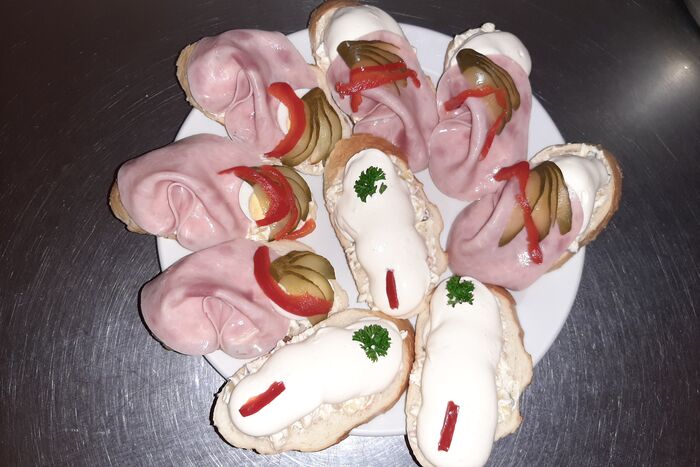
Mléčná jídelna Astra v.o.s. uses a combination mark — pairing symbol with wordmark for versatility. Moderate detail — balancing distinctiveness with versatility. Style: traditional, friendly, handwritten.
Combination Mark
rectangle
Icon + Text
6/10
Brand Character
Mléčná jídelna Astra v.o.s. is authoritative and decisive, warm and approachable, simply spoken and accessible.
first_plural
middle_school
direct
Signature Words
Design Playbook
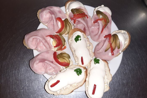
food photography
natural
realistic
horizontal
rounded
comfortable
Digital Footprint
.
Market Presence
Local market, headquartered in Ostrava, CZ, communicating in 2 languages.
CZ
Ostrava, CZ
local
en, cs
Mléčná jídelna Astra v.o.s. is a trademark of its respective owner. Bivernado is not affiliated with, endorsed by, or sponsored by Mléčná jídelna Astra v.o.s.. All brand data shown here is collected from publicly available sources and analyzed for informational and research purposes under fair use principles. Request removal →
Logo Variants
Primary Raster
Primary LogoPrimary shape: rectangle
Brand Codes
Established 1998
The brand highlights its founding year of 1998, emphasizing its long-standing tradition in the food industry.
Czech Cuisine
The brand offers traditional Czech cuisine, appealing to local tastes and cultural preferences.
Astra Orange
The color #ff5722 is used consistently in the logo, buttons, and links, creating a distinctive visual identity.
Dairy-Related Name
The name 'Mléčná jídelna' (Dairy Diner) indicates a focus on dairy products and traditional Czech cuisine.
More brands in Food Service
Explore other brands in this industry to compare visual identities.