Moravská keramika z dílny Kaňovských
The Innocent“Moravská keramika”
Serves Individuals interested in traditional Czech crafts and handmade pottery.
What Drives Them
Values simplicity and honesty. Trusted for being genuine.
Color Intelligence
Moravská keramika z dílny Kaňovských anchors on a muted Blue (#282842) as their primary brand signal, paired with Blue (#253472), and accented by Blue. The palette balances warm and cool tones.
#282842
Primary
#253472
Secondary
#00007e
Accent
#ffc807
Accent
#000000
Background
#d5d3cf
Background
Typography
Moravská keramika z dílny Kaňovských uses Poppins across both headings and body — a sans-serif — clean, modern, and optimized for digital. Single-font system — disciplined and consistent.
Logo Anatomy
Moderate detail — balancing distinctiveness with versatility. Style: minimalist, modern.
icon_symbol
circle
Icon + Text
4/10
Brand Character
Moravská keramika z dílny Kaňovských is authoritative and decisive, warm and approachable, simply spoken and accessible.
first_plural
middle_school
soft
Signature Words
Design Playbook
product photography, lifestyle
natural
natural
flat
standard
rounded
comfortable
image
Digital Footprint
active on 2 social platforms.
Market Presence
Nationwide presence, based in CZ.
CZ
national
cs
Moravská keramika z dílny Kaňovských is a trademark of its respective owner. Bivernado is not affiliated with, endorsed by, or sponsored by Moravská keramika z dílny Kaňovských. All brand data shown here is collected from publicly available sources and analyzed for informational and research purposes under fair use principles. Request removal →
Logo Variants
Primary Raster
Primary LogoPrimary shape: circle
Brand Codes
Tradition
Emphasizes traditional pottery techniques.
Indigo Blue
Used in the logo and website design.
Poppins
Modern and readable font used throughout the site.
Artisanal
Close-up shots of pottery being made and finished products.
Stylized Plant Icon
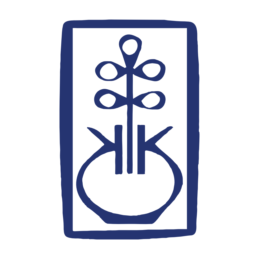
A stylized plant icon with circular elements and vertical lines, enclosed in a rectangular frame, is used as a logo and recurring visual element.
Social Media Intelligence
More brands in Arts & Crafts
Explore other brands in this industry to compare visual identities.