Zdravotní ústav Most k domovu
The RulerServes Patients with terminal illnesses and their families
What Drives Them
Organized and dependable. Creates order and stability.
Color Intelligence
Zdravotní ústav Most k domovu anchors on a muted Blue (#8c89a8) as their primary brand signal, paired with Blue (#352c7a), and accented by Blue. The palette leans cool — projecting trust and professionalism.
#8c89a8
Primary
#352c7a
Secondary
#676294
Accent
#b5b3c2
Background
#fefefe
Background
#140c64
Accent
Typography
Logo Anatomy
Zdravotní ústav Most k domovu uses a combination mark — pairing symbol with wordmark for versatility.
Combination Mark
Icon + Text
Brand Character
Design Playbook
Digital Footprint
.
Market Presence
Nationwide presence, based in CZ.
CZ
national
Zdravotní ústav Most k domovu is a trademark of its respective owner. Bivernado is not affiliated with, endorsed by, or sponsored by Zdravotní ústav Most k domovu. All brand data shown here is collected from publicly available sources and analyzed for informational and research purposes under fair use principles. Request removal →
Logo Variants
Primary Raster
Primary LogoBrand Codes
Star of Life
The blue Star of Life symbol is used in the logo, indicating a connection to emergency medical services or healthcare.
Caring Portrait
The website features a portrait of an elderly woman, suggesting a focus on elderly care and a compassionate approach.
Products & Business
%20(1).webp)

.webp)
.webp)
.webp)

Showing 8 of 12 product images
Ambulance paliativní medicíny
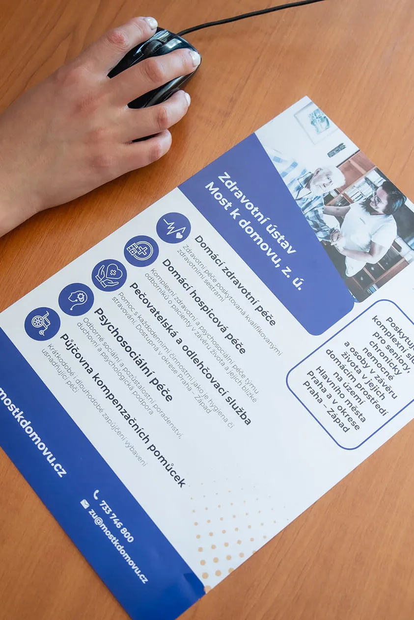
Domácí hospicová péče
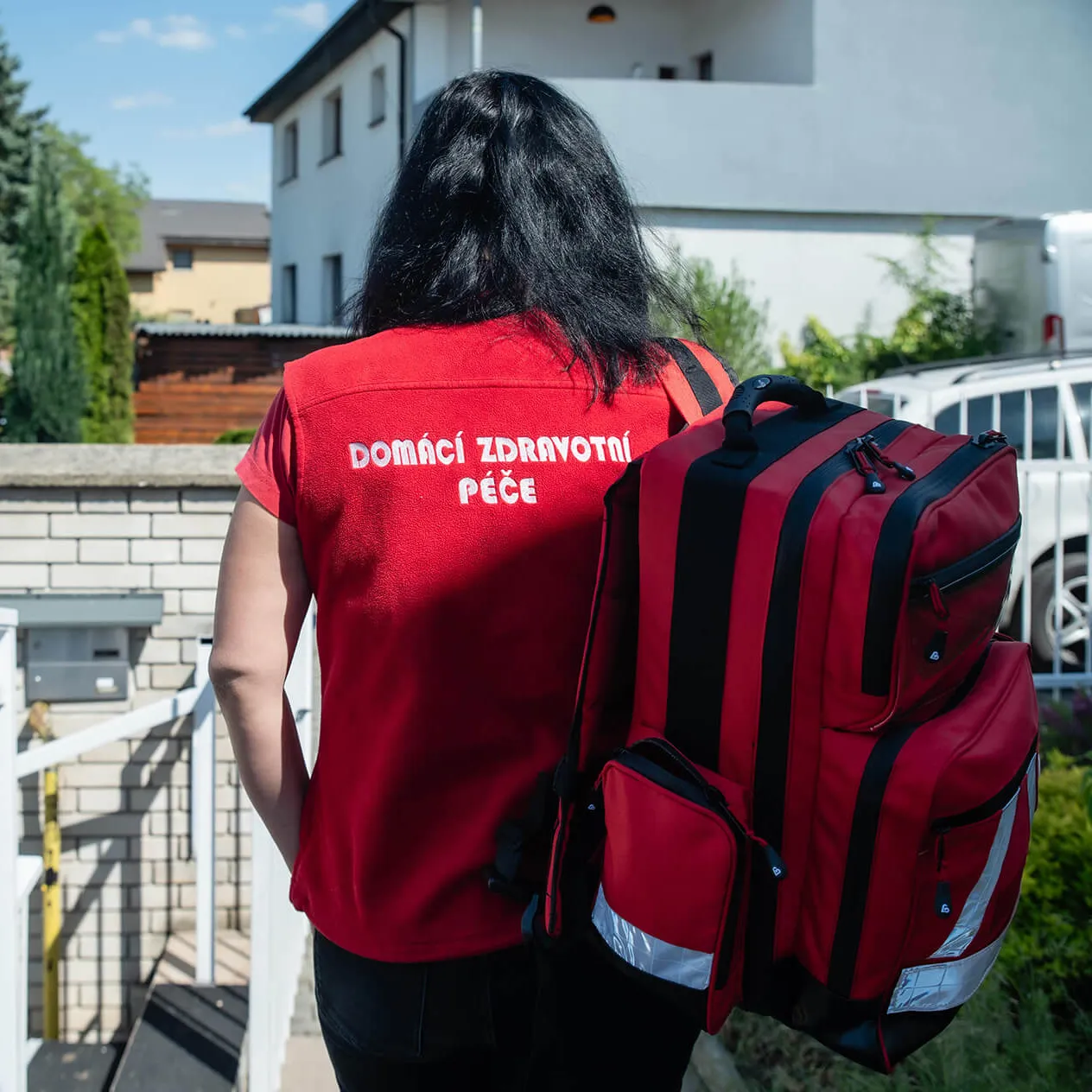
Domácí zdravotní péče
Duchovní péče
Odborné sociální poradenství
Pečovatelská služba
Pozůstalostní péče
Půjčovna kompenzačních pomůcek
Showing 8 of 9 products
More brands in Healthcare
Explore other brands in this industry to compare visual identities.




