Nábytek Čertovina
The JesterServes Families with children
What Drives Them
Finds joy in the moment. Connects through humor and lightheartedness.
Color Intelligence
Nábytek Čertovina anchors on Red (#dfbab8) as their primary brand signal, paired with Red (#811905), and accented by Red. The palette leans warm — inviting and energetic.
#dfbab8
Primary
#811905
Secondary
#a1312c
Accent
#c17d7a
Accent
#be3b37
Accent
#fcf9f8
Background
Typography
Headings set in bely-display (a display face — designed for headlines and visual impact), body in bely (a serif — evoking tradition, authority, and print heritage).
Logo Anatomy
Nábytek Čertovina uses a combination mark — pairing symbol with wordmark for versatility.
Combination Mark
Icon + Text
Brand Character
Nábytek Čertovina is casual and conversational, authoritative and decisive, warm and approachable — also energetic and passionate and simply spoken and accessible and playful and witty.
third
middle_school
playful
Signature Words
Design Playbook
candid, event photography
natural
saturated
flat
sticky
rounded
loose
video
Digital Footprint
Built on WordPress, active on 5 social platforms.
Market Presence
Regional presence, based in CZ.
CZ
regional
cs
Nábytek Čertovina is a trademark of its respective owner. Bivernado is not affiliated with, endorsed by, or sponsored by Nábytek Čertovina. All brand data shown here is collected from publicly available sources and analyzed for informational and research purposes under fair use principles. Request removal →
Logo Variants

Primary Raster
Primary LogoBrand Codes
Peklo Theme
The entire brand is themed around Czech folklore and the concept of hell, creating a unique and memorable experience.
Czech Folklore
References to Czech folklore and mythology are woven throughout the brand's identity, from the name to the interior design.
Peklo Naming
The use of 'Peklo' (Hell) and 'Čertovina' (Devilry) in the brand name and related terms creates a consistent and thematic naming convention.
Čertovina Blue
The shade #3858e9 is used consistently in the website design, particularly in buttons and links, creating a visual association with the brand.
Devil
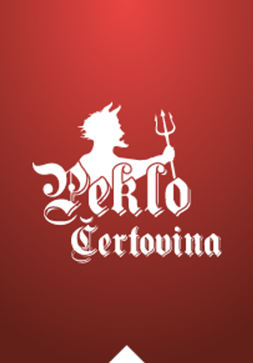
A devil figure with horns and a trident is used as a mascot.
Peklo Certovina
The logo features a distinctive gothic-style typeface for the words "Peklo Certovina".
Theatrical staging
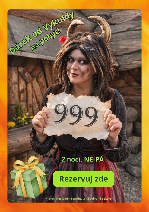
The photography style features theatrical staging with people in costume, creating a dramatic and immersive atmosphere.
Products & Business
More brands in Hospitality
Explore other brands in this industry to compare visual identities.

