NeoVize
The CaregiverServes Individuals seeking advanced eye care solutions
What Drives Them
Puts people first. Builds trust through genuine care.
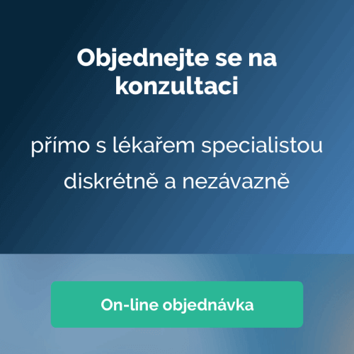
NeoVize focuses on providing clear vision through advanced surgical and diagnostic procedures. The emphasis on 'Život bez brýlí' (Life without glasses) and transparent pricing reinforces this core concept of clarity.
Color Intelligence
NeoVize anchors on Blue (#2e6da4) as their primary brand signal, paired with Green (#3c763d), and accented by Blue. The palette leans cool — projecting trust and professionalism.
#2e6da4
Primary
#3c763d
Secondary
#dff0d8
Background
#2b542c
Text
#d9edf7
Surface
#8ac1ef
Accent
Typography
Headings set in Italian Plate (a display face — designed for headlines and visual impact), body in Raleway (a sans-serif — clean, modern, and optimized for digital). 3 typeface families in play — a richer, more layered typographic system.
Logo Anatomy
Brand Character
NeoVize is formal and professional, authoritative and decisive, warm and approachable.
first_plural
high_school
direct
Signature Words
Design Playbook
clinical, patient-focused, medical
natural
full_color
flat
top_navigation
rounded
comfortable
image_carousel
Digital Footprint
Built on WordPress, active on 3 social platforms.
Market Presence
Nationwide presence, headquartered in Prague, CZ.
CZ
Prague, CZ
national
cs
NeoVize is a trademark of its respective owner. Bivernado is not affiliated with, endorsed by, or sponsored by NeoVize. All brand data shown here is collected from publicly available sources and analyzed for informational and research purposes under fair use principles. Request removal →
Brand Codes
NeoVize Blue
The specific shade of blue (#2e6da4) used in the logo and throughout the website.
Italian Plate Display
The distinctive 'Italian Plate' font used for headings.
Medical Terminology
Use of medical terminology and specific eye-related vocabulary.
Before & After Galleries
Prominent display of before and after photos of patients.
Products & Business
More brands in Healthcare
Explore other brands in this industry to compare visual identities.