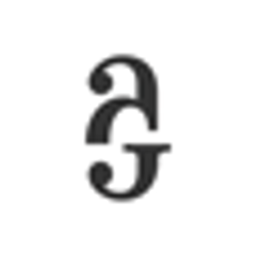
Oblastní galerie Vysočiny v Jihlavě
“Od července 2024 až do června 2026 rekonstruujeme galerijní prostory.”
Serves Art enthusiasts, students, and local community members
What Drives Them
Color Intelligence
Oblastní galerie Vysočiny v Jihlavě anchors on a vivid Blue (#a990fd) as their primary brand signal, paired with Yellow (#f8fa26), and accented by Pink. The palette leans warm — inviting and energetic.
#a990fd
Primary
#f8fa26
Secondary
#53404c
Accent
#fcfcfc
Background
#d1cdca
Accent
#948a90
Accent
Typography
Headings set in atyp (a sans-serif — clean, modern, and optimized for digital), body in Segoe UI (a sans-serif — clean, modern, and optimized for digital). 3 typeface families in play — a richer, more layered typographic system.
Logo Anatomy
Brand Character
Oblastní galerie Vysočiny v Jihlavě is formal and professional, authoritative and decisive.
third
college
soft
Signature Words
Design Playbook
Digital Footprint
active on 4 social platforms.
Market Presence
Regional presence, headquartered in Jihlava, CZ, communicating in 2 languages.
CZ
Jihlava, CZ
regional
cs, en
Oblastní galerie Vysočiny v Jihlavě is a trademark of its respective owner. Bivernado is not affiliated with, endorsed by, or sponsored by Oblastní galerie Vysočiny v Jihlavě. All brand data shown here is collected from publicly available sources and analyzed for informational and research purposes under fair use principles. Request removal →
Brand Codes
#a990fd
Used as a primary accent color for links and highlights.
atyp
Used for headings, giving a modern and artistic feel.
Yellow sans-serif
The gallery uses a bold, yellow sans-serif typeface for headlines and calls to action.
Star
The gallery uses a star shape to highlight the fact that they are closed for reconstruction.
Social Media Intelligence
More brands in Arts and Culture
Explore other brands in this industry to compare visual identities.