orol
The Everyman“Vítejte na našich stránkách”
Serves local workers
What Drives Them
Relatable and down-to-earth. Connects through belonging.
Given the values of freshness, quality, and the implied convenience of a local brand, 'Freshness' encapsulates the core offering and desired perception. It's the most immediate and impactful differentiator.
Color Intelligence
The palette leans warm — inviting and energetic.
#181818
Text
#393939
Text
#d4d5d9
Background
#ababab
Background
#f6f6f6
Background
#000000
Text
Typography
Logo Anatomy
orol uses a combination mark — pairing symbol with wordmark for versatility.
Combination Mark
Icon + Text
Brand Character
Design Playbook
Digital Footprint
.
Market Presence
Nationwide presence, based in CZ.
CZ
national
cs
orol is a trademark of its respective owner. Bivernado is not affiliated with, endorsed by, or sponsored by orol. All brand data shown here is collected from publicly available sources and analyzed for informational and research purposes under fair use principles. Request removal →
Logo Variants

Primary Raster
Primary LogoBrand Codes
Circle with utensils
A white circle containing a spoon, fork, and knife is used as a visual element.
OROL font
The word 'OROL' is written in a bold, sans-serif font, distinct from the 'Lidová Jídelna' text.
Products & Business
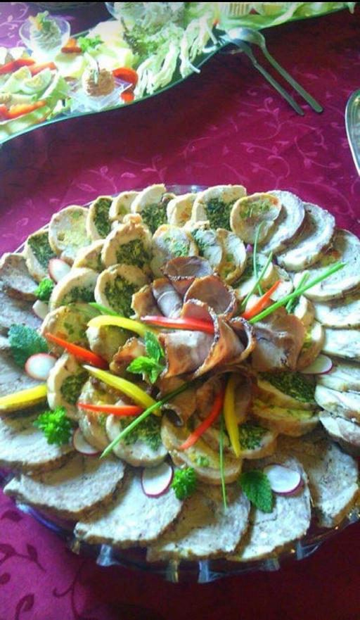
Obědy (Lunches)
More brands in food_service
Explore other brands in this industry to compare visual identities.