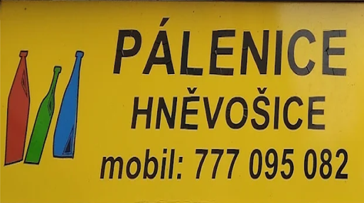
Pálenice Hněvošice, s.r.o.
The InnocentServes Local fruit growers and brandy enthusiasts
What Drives Them
Values simplicity and honesty. Trusted for being genuine.
Color Intelligence
Pálenice Hněvošice, s.r.o. anchors on Yellow (#c7a41a) as their primary brand signal, paired with Yellow (#9b7c21), and accented by Orange. The palette leans warm — inviting and energetic.
#c7a41a
Primary
#9b7c21
Secondary
#4e3e21
Accent
#755f28
Accent
#334960
Accent
#8a3621
Accent
Typography
Headings set in Poppins (a sans-serif — clean, modern, and optimized for digital), body in Inter (a sans-serif — clean, modern, and optimized for digital).
Logo Anatomy
Pálenice Hněvošice, s.r.o. uses a combination mark — pairing symbol with wordmark for versatility. Moderate detail — balancing distinctiveness with versatility. Style: naturalistic, traditional, agricultural.
Combination Mark
rectangle
Icon + Text
6/10
Brand Character
Pálenice Hněvošice, s.r.o. is authoritative and decisive, warm and approachable, energetic and passionate.
third
high_school
direct
Signature Words
Design Playbook
natural, product shots, outdoor
natural
realistic
flat
top
rounded
comfortable
image
Digital Footprint
.
Market Presence
Local market, based in CZ.
CZ
local
cs
Pálenice Hněvošice, s.r.o. is a trademark of its respective owner. Bivernado is not affiliated with, endorsed by, or sponsored by Pálenice Hněvošice, s.r.o.. All brand data shown here is collected from publicly available sources and analyzed for informational and research purposes under fair use principles. Request removal →
Logo Variants
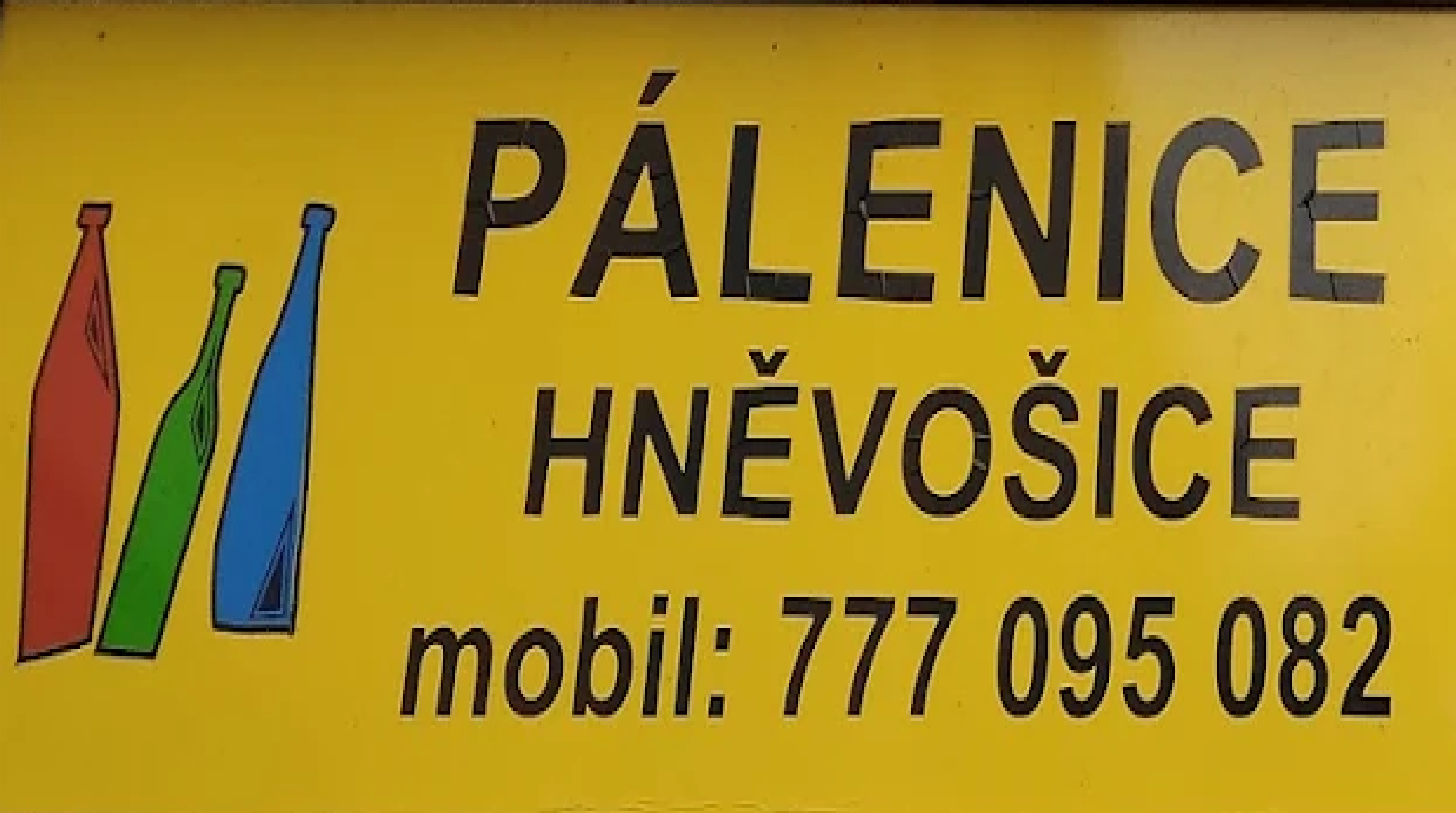
Primary Raster
Primary LogoPrimary shape: rectangle
Brand Codes
Founded 2025
The website mentions the founding year of 2025, emphasizing the brand's recent establishment.
Hněvošice Green
The color #2d7f3e is used consistently throughout the website for headings, buttons, and accents, creating a cohesive visual identity.
Czech Distillery Tradition
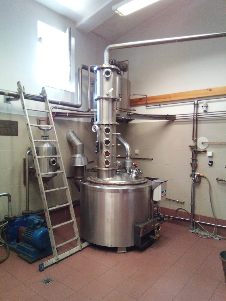
The brand emphasizes traditional fruit brandy production methods, reflecting Czech cultural heritage.
Geographic Origin
The brand name includes the location 'Hněvošice', emphasizing its local origin and regional identity.
Stylized Bottles
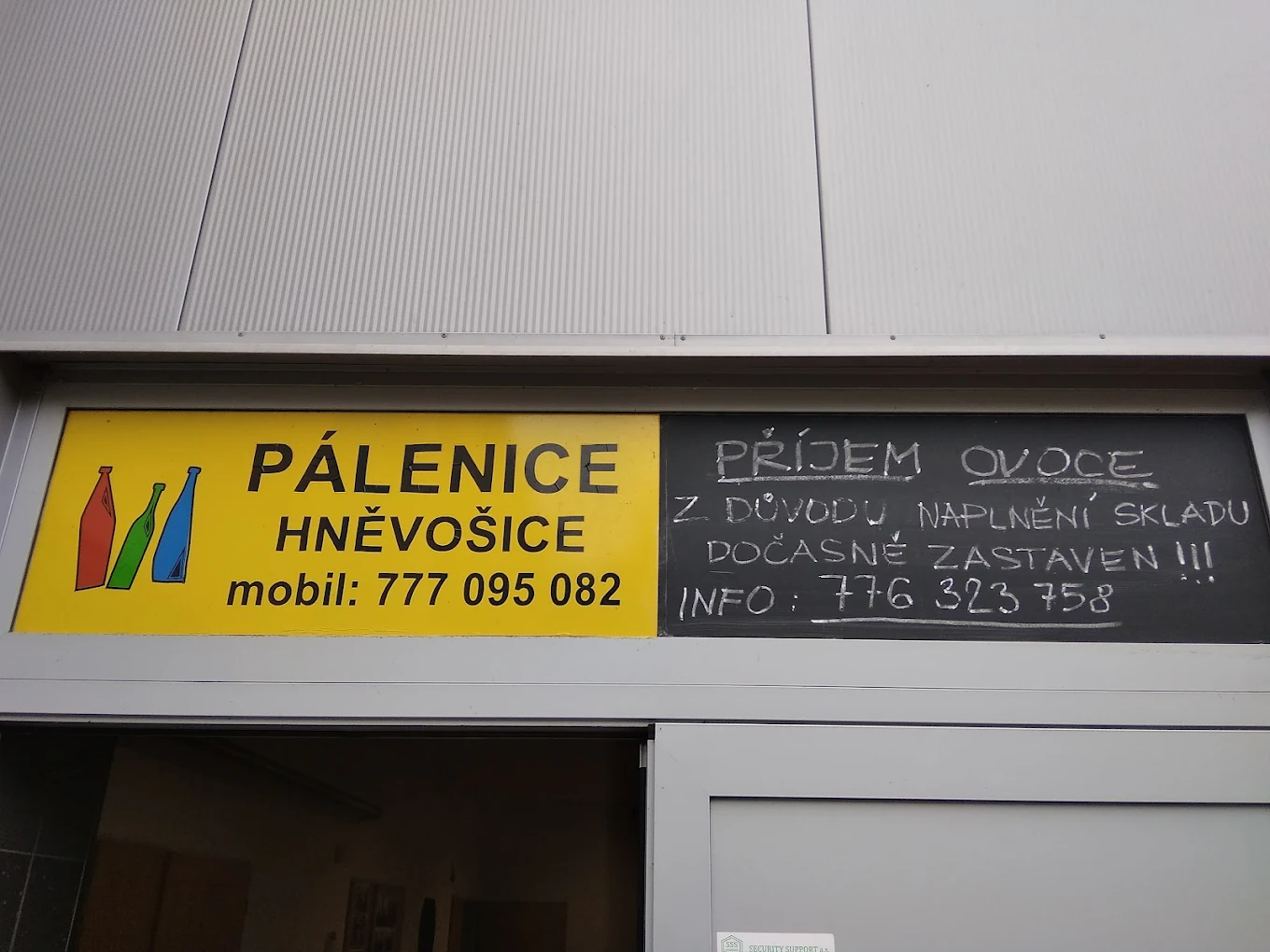
The logo features three stylized bottles in blue, green, and yellow, suggesting the product and brand identity.
Products & Business

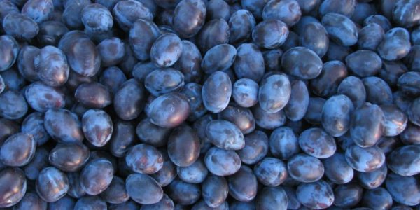
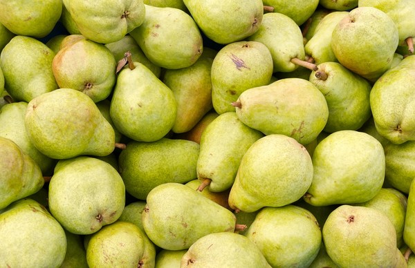
More brands in Food & Beverage
Explore other brands in this industry to compare visual identities.

![0,75 [Sedmička] logo](/assets/075-cz/logo/512.png)

