Pension Mikulka
The Ruler“Levné ubytování pro nenáročnou klientelu”
Serves Budget travelers
What Drives Them
Organized and dependable. Creates order and stability.
Color Intelligence
Pension Mikulka anchors on a muted Blue (#39404e) as their primary brand signal, paired with Blue (#0097f5), and accented by Blue. The palette leans cool — projecting trust and professionalism.
#39404e
Primary
#0097f5
Secondary
#c6e8fd
Accent
#185ea1
Accent
#9e755c
Accent
#57540f
Accent
Typography
Headings set in Montserrat Flex (a sans-serif — clean, modern, and optimized for digital), body in Noto Sans JP (a sans-serif — clean, modern, and optimized for digital). 3 typeface families in play — a richer, more layered typographic system.
Logo Anatomy
Pension Mikulka uses a combination mark — pairing symbol with wordmark for versatility.
Combination Mark
Icon + Text
Brand Character
Pension Mikulka is warm and approachable, simply spoken and accessible.
third
middle_school
direct
Signature Words
Design Playbook
natural
full_color
top
rounded
loose
Digital Footprint
Built on Webnode.
Market Presence
Local market, based in CZ.
CZ
local
cs
Pension Mikulka is a trademark of its respective owner. Bivernado is not affiliated with, endorsed by, or sponsored by Pension Mikulka. All brand data shown here is collected from publicly available sources and analyzed for informational and research purposes under fair use principles. Request removal →
Logo Variants

Primary Raster
Primary LogoBrand Codes
Location Specificity
Naming services by location.
#4a5333
Used as a primary accent color, creating a natural and earthy feel.
Montserrat Flex
Used for headings, providing a modern and professional feel.
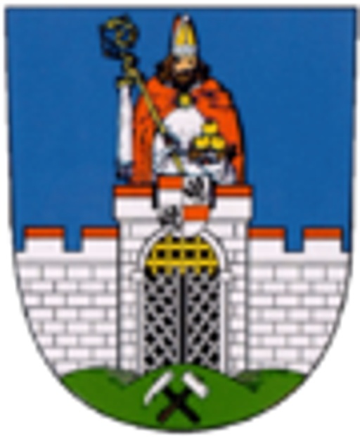
Coat of Arms
The coat of arms features a figure in red and white robes holding a staff and a bowl of golden objects, standing atop a white castle with a gate, set against a blue background above a green hill with mining symbols.
More brands in Travel
Explore other brands in this industry to compare visual identities.