
Penzion Wolf
The Innocent“Penzion a Autokemp Wolf u Rozkoše”
Serves Families and tourists seeking affordable accommodation near Rozkoš reservoir.
What Drives Them
Values simplicity and honesty. Trusted for being genuine.
Penzion Wolf emphasizes a comfortable, family-friendly atmosphere near nature (Rozkoš), fostering a sense of community and shared experience, all while maintaining affordability and a welcoming, traditional Czech identity.
Color Intelligence
Penzion Wolf anchors on a vivid Blue (#0084b4) as their primary brand signal, paired with Green (#3c763d). The palette leans cool — projecting trust and professionalism.
#0084b4
Primary
#3c763d
Secondary
#dff0d8
Background
#34495e
Text
#d9edf7
Surface
Typography
Headings set in Roboto Slab (a slab serif — bold and impactful, blending tradition with modern punch), body in Roboto (a sans-serif — clean, modern, and optimized for digital). 4 typeface families in play — a richer, more layered typographic system.
Logo Anatomy
Brand Character
Penzion Wolf is authoritative and decisive, warm and approachable, simply spoken and accessible.
third
middle_school
direct
Signature Words
Design Playbook
natural
full_color
dropdown
rounded
comfortable
image
Digital Footprint
Built on WordPress, active on 1 social platform.
Market Presence
Local market, headquartered in Provodov - Šonov, CZ.
CZ
Provodov - Šonov, CZ
local
cs
Penzion Wolf is a trademark of its respective owner. Bivernado is not affiliated with, endorsed by, or sponsored by Penzion Wolf. All brand data shown here is collected from publicly available sources and analyzed for informational and research purposes under fair use principles. Request removal →
Brand Codes
Regional Identity
References to the location near Rozkoš reservoir and the surrounding Czech countryside.
Czech Blue
The use of #0084b4 as a primary color in the website design.
Products & Business
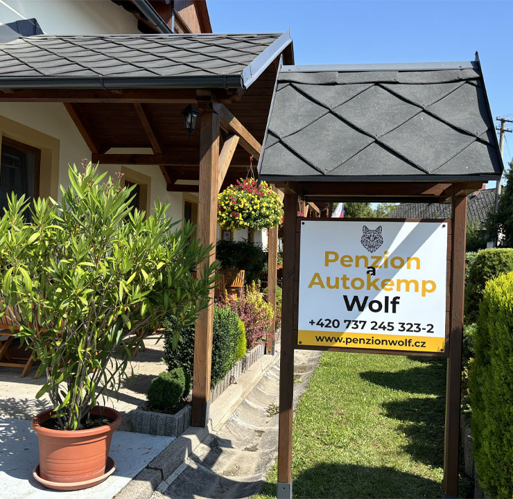
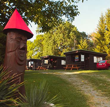
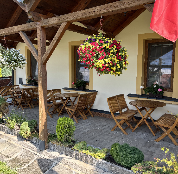
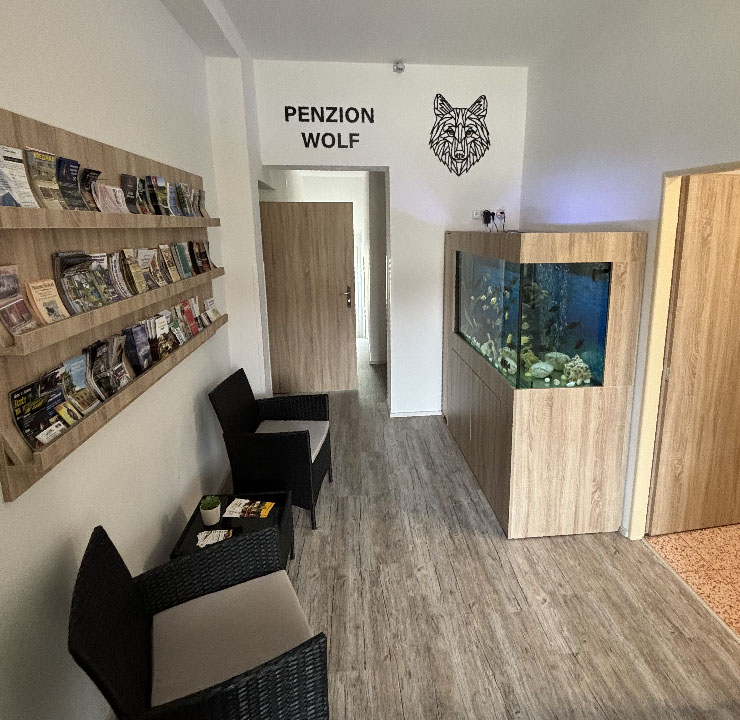


Showing 8 of 10 product images
More brands in Hospitality
Explore other brands in this industry to compare visual identities.

