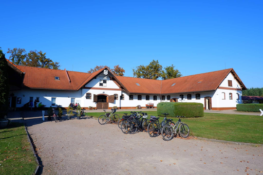
Penzion Kolesa
The Innocent“a v samém srdci koňského ráje (jen 3 km od Národního hřebčína Kladruby nad Labem) se rozkládá malebný areál Vasury Kolesa.”
Serves Families and couples seeking a relaxing getaway in a rural setting.
What Drives Them
Values simplicity and honesty. Trusted for being genuine.
The brand is deeply connected to horses and the surrounding equestrian culture, as evidenced by its location near the Kladruby stud farm, its 'koňského ráje' tagline, and the 'Horse Riding Region' brand code. The overall brand experience centers around this theme.
Color Intelligence
Penzion Kolesa anchors on a muted Orange (#976f60) as their primary brand signal, paired with Blue (#62baf8), and accented by Blue. The palette leans warm — inviting and energetic.
#976f60
Primary
#62baf8
Secondary
#7698b2
Accent
#d55f38
Accent
#333333
Text
#f8f8f8
Background
Typography
Headings set in Big Shoulders Display (a display face — designed for headlines and visual impact), body in Exo 2 (a sans-serif — clean, modern, and optimized for digital).
Logo Anatomy
Penzion Kolesa uses a combination mark — pairing symbol with wordmark for versatility. Moderate detail — balancing distinctiveness with versatility. Style: rustic, nature-inspired, traditional.
Combination Mark
rectangle
Icon + Text
6/10
Brand Character
Penzion Kolesa is warm and approachable, energetic and passionate, simply spoken and accessible.
third
middle_school
direct
Signature Words
Design Playbook
natural, outdoor, lifestyle
natural
natural
flat
horizontal
rounded
comfortable
image
Digital Footprint
Built on WordPress, active on 1 social platform.
Market Presence
Local market, headquartered in Kladruby nad Labem, CZ.
CZ
Kladruby nad Labem, CZ
local
cs
Penzion Kolesa is a trademark of its respective owner. Bivernado is not affiliated with, endorsed by, or sponsored by Penzion Kolesa. All brand data shown here is collected from publicly available sources and analyzed for informational and research purposes under fair use principles. Request removal →
Logo Variants

Primary Raster
Primary LogoPrimary shape: rectangle
Brand Codes
Rural Location
Emphasis on the location in the heart of the horse-riding region near Kladruby nad Labem.
Terracotta Orange
Consistent use of #d55f38 across buttons, links, and accents.
Big Shoulders Display Heading
Use of Big Shoulders Display for headings, creating a bold and slightly vintage feel.
Horse Riding Region
Association with the famous Kladruby nad Labem horse breeding region.
More brands in Hospitality
Explore other brands in this industry to compare visual identities.

