Ski & Sport Kouty
The Explorer“Ubytování v Koutech nad Desnou”
Serves Families and outdoor enthusiasts seeking accommodation in Kouty nad Desnou.
What Drives Them
Pushes boundaries. Seeks new frontiers and experiences.
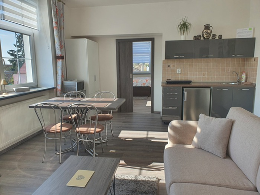
The brand heavily emphasizes its location (Kouty nad Desnou) and offers comfortable accommodation options (apartments, guesthouses, cottages). This combination suggests a focus on providing a relaxing and convenient experience tied to a specific place.
Color Intelligence
Ski & Sport Kouty anchors on a muted Blue (#363d4a) as their primary brand signal, paired with Orange (#875f31). The palette balances warm and cool tones.
#363d4a
Primary
#875f31
Secondary
#e2e3e4
Background
#847c78
Background
#b2a9a2
Background
#141f32
Background
Typography
Single-font system — disciplined and consistent.
Logo Anatomy
Brand Character
Ski & Sport Kouty is warm and approachable, energetic and passionate, simply spoken and accessible.
third
middle_school
direct
Signature Words
Design Playbook
Digital Footprint
.
Market Presence
Local market, based in CZ.
CZ
local
cs
Ski & Sport Kouty is a trademark of its respective owner. Bivernado is not affiliated with, endorsed by, or sponsored by Ski & Sport Kouty. All brand data shown here is collected from publicly available sources and analyzed for informational and research purposes under fair use principles. Request removal →
Brand Codes
Regional Identity
References to Kouty nad Desnou and the Jeseníky Mountains region.
Location-Based Naming
Accommodation names reflect location: Chata Domeček, Penzion Sokolka, Apartmány pod Sokolkou.
Teal Blue
Consistent use of #3fbfff for accents and highlights.
More brands in Travel & Tourism
Explore other brands in this industry to compare visual identities.