Pizzerie Fortuna
The InnocentServes Families and locals seeking Italian cuisine
What Drives Them
Values simplicity and honesty. Trusted for being genuine.
Pizzerie Fortuna emphasizes its connection to Ostrava and the local community through its name, location-specific keywords, and focus on Czech and Italian cuisine. The brand aims to be a neighborhood favorite, offering a familiar and welcoming experience.
Color Intelligence
Pizzerie Fortuna anchors on a muted Blue (#263339) as their primary brand signal, paired with Green (#879b82), and accented by Orange. The palette leans warm — inviting and energetic.
#000000
Text
#263339
Primary
#879b82
Secondary
#3a2319
Accent
#593a2a
Accent
#ffffff
Background
Typography
Headings set in Pacifico (a handwritten style — projecting personality and human warmth), body in Open Sans (a sans-serif — clean, modern, and optimized for digital). 3 typeface families in play — a richer, more layered typographic system.
Logo Anatomy
Brand Character
Pizzerie Fortuna is authoritative and decisive, warm and approachable, energetic and passionate — also simply spoken and accessible.
third
middle_school
direct
Signature Words
Design Playbook
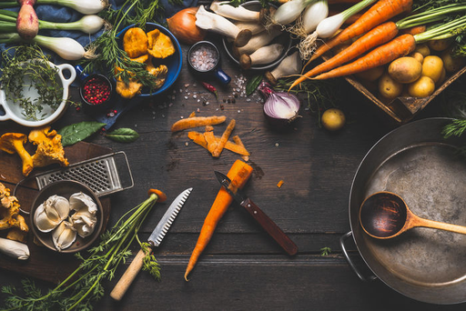
food photography, restaurant interior
natural
full color
flat
horizontal
rounded
comfortable
image
Digital Footprint
Built on WordPress, active on 2 social platforms.
Market Presence
Local market, headquartered in Ostrava, CZ, communicating in 2 languages.
CZ
Ostrava, CZ
local
en, cs
Pizzerie Fortuna is a trademark of its respective owner. Bivernado is not affiliated with, endorsed by, or sponsored by Pizzerie Fortuna. All brand data shown here is collected from publicly available sources and analyzed for informational and research purposes under fair use principles. Request removal →
Brand Codes
Traditional Cuisine
Emphasis on traditional Italian recipes and cooking methods.
Czech Location
References to being located in Ostrava, Czech Republic.
Fortuna Green
The green color (#09ad7e) used in the logo and website elements.
More brands in Restaurant
Explore other brands in this industry to compare visual identities.