Pod Koberštejnem
Serves Families with children, couples, and small groups seeking a quiet nature retreat.
What Drives Them
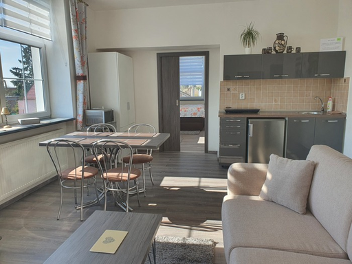
The brand emphasizes relaxation, family, and comfort within a rustic, nature-oriented setting. This suggests a core positioning around creating a warm and inviting space for families to connect and enjoy time together.
Color Intelligence
Pod Koberštejnem anchors on a muted Orange (#39312c) as their primary brand signal, paired with Orange (#63554b), and accented by Gray. The palette balances warm and cool tones.
#39312c
Primary
#63554b
Secondary
#a8acb0
Accent
#d4d7d8
Accent
#7bdcb5
Accent
#fafafa
Background
Typography
Single-font system — disciplined and consistent.
Logo Anatomy
Brand Character
Design Playbook
Digital Footprint
.
Market Presence
Nationwide presence, based in CZ.
CZ
national
cs
Pod Koberštejnem is a trademark of its respective owner. Bivernado is not affiliated with, endorsed by, or sponsored by Pod Koberštejnem. All brand data shown here is collected from publicly available sources and analyzed for informational and research purposes under fair use principles. Request removal →
Products & Business
Apartment Rental
Rejvíz Ceramics
Sauna Access
More brands in Travel & Tourism
Explore other brands in this industry to compare visual identities.