Pohřební služba KHÁRON
The InnocentServes Families planning funeral arrangements
What Drives Them
Values simplicity and honesty. Trusted for being genuine.
The brand emphasizes dignity, empathy, and a respectful personality. The high formality and warmth scores, combined with traditional values and heritage, point to a core positioning around respectfulness in handling funeral arrangements.
Color Intelligence
Pohřební služba KHÁRON anchors on a muted Orange (#5d5546) as their primary brand signal, paired with Orange (#d7b46a), and accented by Orange. The palette balances warm and cool tones.
#5d5546
Primary
#d7b46a
Secondary
#9a815b
Accent
#199fc9
Accent
#38abce
Accent
#000001
Background
Typography
Logo Anatomy
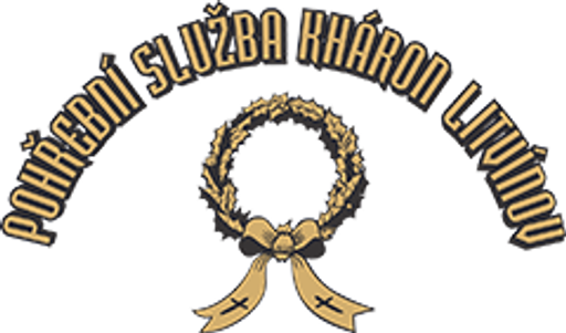
Pohřební služba KHÁRON uses a combination mark — pairing symbol with wordmark for versatility.
Combination Mark
Icon + Text
Brand Character
Pohřební služba KHÁRON is formal and professional, warm and approachable.
first_plural
middle_school
direct
Signature Words
Design Playbook
Digital Footprint
active on 2 social platforms.
Market Presence
Local market, headquartered in Litvínov, CZ.
CZ
Litvínov, CZ
local
cs
Pohřební služba KHÁRON is a trademark of its respective owner. Bivernado is not affiliated with, endorsed by, or sponsored by Pohřební služba KHÁRON. All brand data shown here is collected from publicly available sources and analyzed for informational and research purposes under fair use principles. Request removal →
Logo Variants
Primary Raster
Primary LogoBrand Codes
Founding Year
Website footer mentions copyright years 2011-2014.
Czech Republic
Services offered throughout the Czech Republic.
Kháron Gold
The color #e0c086 is used for accents and highlights throughout the website.
More brands in Funeral Services
Explore other brands in this industry to compare visual identities.