Pretty woman & man
The Ruler“Jsme jediné studio v Praze, které má mnoho let metodu bailine, která byla původně vyvinuta pro kosmonauty v Norsku. Je to jediná originální metoda při které můžete spolehlivě hubnout, tvarovat a nasva”
Serves Women and men seeking aesthetic and weight loss treatments
What Drives Them
Organized and dependable. Creates order and stability.
Color Intelligence
Pretty woman & man anchors on Orange (#d6c5b1) as their primary brand signal, paired with Orange (#d3b06a), and accented by Blue. The palette balances warm and cool tones.
#d6c5b1
Primary
#d3b06a
Secondary
#0097f5
Accent
#26a6f6
Accent
#fdfeff
Background
#977d68
Accent
Typography
Headings set in Marcellus (a serif — evoking tradition, authority, and print heritage), body in Open Sans Flex (a sans-serif — clean, modern, and optimized for digital). This serif/sans pairing creates classic typographic contrast. 4 typeface families in play — a richer, more layered typographic system.
Logo Anatomy
Pretty woman & man uses a combination mark — pairing symbol with wordmark for versatility.
Combination Mark
Icon + Text
Brand Character
Pretty woman & man is authoritative and decisive, energetic and passionate.
first_plural
high_school
direct
Signature Words
Design Playbook
beauty, lifestyle
natural
full_color
flat
horizontal
rounded
comfortable
image
Digital Footprint
Built on webnode, active on 2 social platforms.
Market Presence
Local market, headquartered in Prague, CZ.
CZ
Prague, CZ
local
cs
Pretty woman & man is a trademark of its respective owner. Bivernado is not affiliated with, endorsed by, or sponsored by Pretty woman & man. All brand data shown here is collected from publicly available sources and analyzed for informational and research purposes under fair use principles. Request removal →
Logo Variants
Primary Raster
Primary LogoBrand Codes
#2b2420
Used for the background and some text elements, creating a sophisticated and elegant feel.
Bailine
Highlights the use of the Bailine method, originally developed for cosmonauts.
Hubnout, tvarovat a nasvalit postavu v leže
Tagline emphasizing the ability to lose weight, shape, and build muscle while lying down.
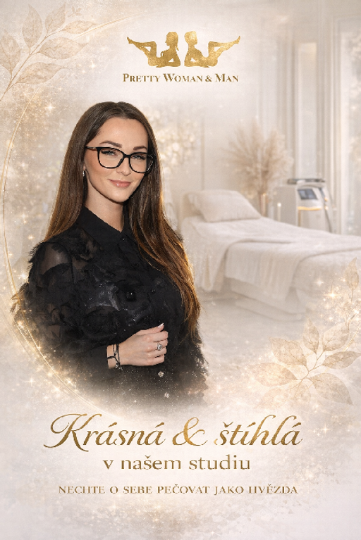
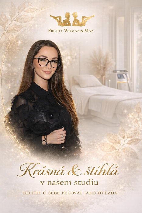
Woman in glasses
A woman with long brown hair and glasses is featured prominently in the brand's promotional materials.
Gold Leaf Accents
The brand uses gold leaf-style illustrations of leaves and sparkles as decorative accents.
Silhouette Logo
The logo features silhouettes of a woman reclining and a man standing, both in gold.
Social Media Intelligence
More brands in Beauty & Wellness
Explore other brands in this industry to compare visual identities.