Proficio
The CreatorServes Businesses seeking marketing and technology solutions
What Drives Them
Brings ideas to life. Values imagination and self-expression.
Proficio focuses on creating e-shops that are not only visually appealing but also functional and user-friendly, emphasizing data-driven optimization and client-centric design to improve online sales performance.
Color Intelligence
Proficio anchors on Blue (#b5e3d8) as their primary brand signal, paired with Blue (#2f4b5f), and accented by Blue. The palette leans cool — projecting trust and professionalism.
#b5e3d8
Primary
#2f4b5f
Secondary
#587883
Accent
#8bb3b2
Accent
#7ca2a5
Accent
#a6b0ba
Accent
Typography
Proficio uses bc_novatica across both headings and body — a sans-serif — clean, modern, and optimized for digital.
Logo Anatomy
Proficio uses a combination mark — pairing symbol with wordmark for versatility. Moderate detail — balancing distinctiveness with versatility. Style: modern, professional, clean.
Combination Mark
abstract
Icon + Text
5/10
Brand Character
Proficio is formal and professional, authoritative and decisive, energetic and passionate.
first_plural
high_school
direct
Signature Words
Design Playbook
professional, corporate
natural
full_color
flat
top_navigation
rounded
comfortable
image_carousel
Digital Footprint
Built on Drupal, active on 4 social platforms.
Market Presence
multinational, based in CZ, communicating in 5 languages.
CZ
multinational
cs, sk, en, de, pl
Proficio is a trademark of its respective owner. Bivernado is not affiliated with, endorsed by, or sponsored by Proficio. All brand data shown here is collected from publicly available sources and analyzed for informational and research purposes under fair use principles. Request removal →
Logo Variants

Primary SVG
Primary LogoPrimary shape: abstract
Brand Codes
Mint Green
The light green color #b5e3d8 is used consistently in the website's design, particularly in backgrounds and accents.
bc_novatica
The bc_novatica font is used for body text and headings, providing a consistent visual identity.
Czech Language Support
The website supports Czech and other Central European languages, reflecting a regional focus.
Service-Oriented Naming
The company emphasizes its core services (Marketing, Consulting, Technology) in its branding and website structure.
Modular Layout
The website uses a modular layout with clearly defined sections for services, team, and contact information.
Products & Business


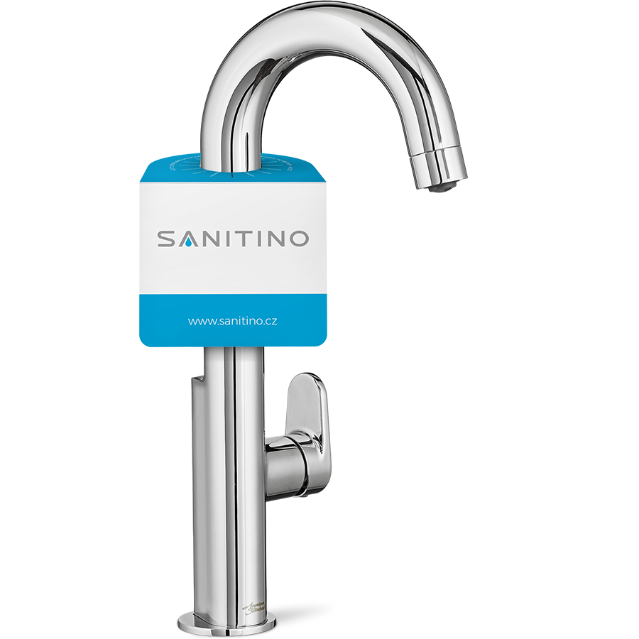


Showing 8 of 12 product images
More brands in Marketing
Explore other brands in this industry to compare visual identities.