
PROMEDICUS domácí péče
The Caregiver“Domácí péče je naše poslání”
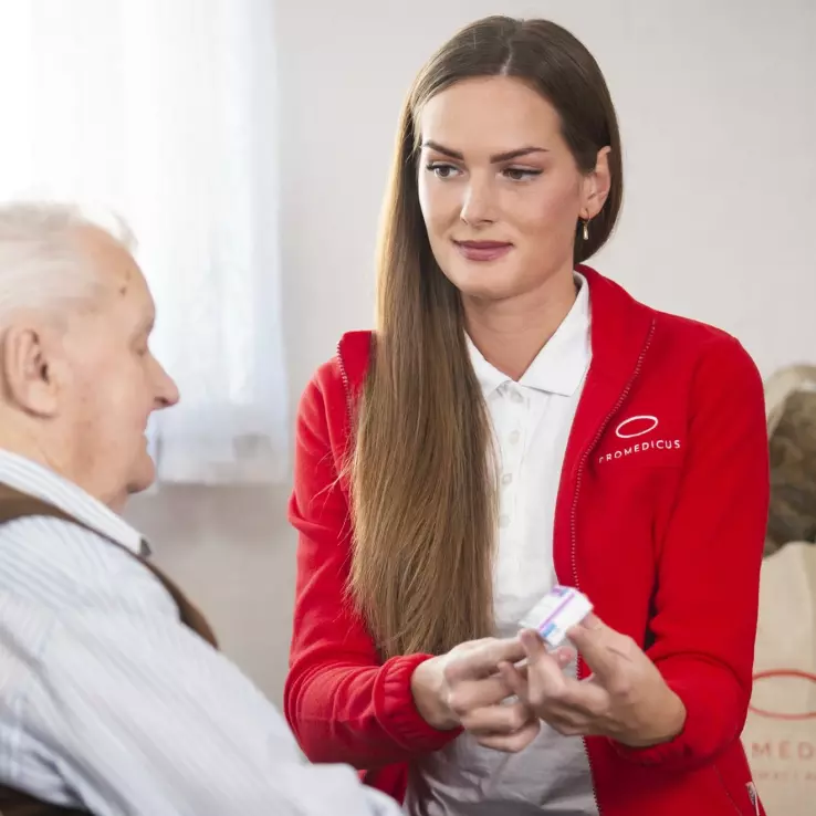
Serves Elderly and disabled individuals requiring in-home care
What Drives Them
Puts people first. Builds trust through genuine care.
PROMEDICUS emphasizes ease of access to home healthcare through insurance coverage, wide geographic reach, readily available information, and quick service initiation, making 'Accessibility' their core differentiator.
Color Intelligence
PROMEDICUS domácí péče anchors on a vivid Red (#ed0009) as their primary brand signal, paired with Green (#42482a), and accented by Red. The palette leans warm — inviting and energetic.
#ed0009
Primary
#000000
Background
#42482a
Secondary
#ffffff
Background
#ad0a1d
Accent
#7bdcb5
Accent
Typography
Headings set in Clear Sans Bd (a sans-serif — clean, modern, and optimized for digital), body in Clear Sans (a sans-serif — clean, modern, and optimized for digital). 4 typeface families in play — a richer, more layered typographic system.
Logo Anatomy
Brand Character
PROMEDICUS domácí péče is authoritative and decisive, warm and approachable, energetic and passionate.
first_plural
middle_school
direct
Signature Words
Design Playbook
Informative, Realistic
natural
full_color
flat
top_navigation
rounded
comfortable
image_carousel
Digital Footprint
Built on WordPress, active on 3 social platforms.
Market Presence
Nationwide presence, based in CZ.
CZ
national
cs
PROMEDICUS domácí péče is a trademark of its respective owner. Bivernado is not affiliated with, endorsed by, or sponsored by PROMEDICUS domácí péče. All brand data shown here is collected from publicly available sources and analyzed for informational and research purposes under fair use principles. Request removal →
Brand Codes
Promedicus Blue
Consistent use of #007cba across the website for primary buttons, links, and accents.
Clear Sans
Use of Clear Sans font family for headings and body text.
Czech Flag Colors
Subtle use of blue and white, colors associated with the Czech flag, in the website design.
Service Area Map
Interactive map displaying service areas.
Products & Business


More brands in Healthcare
Explore other brands in this industry to compare visual identities.




