PŮJČOVNA ŠATŮ JANEL
The Everyman“Půjčovna šatů Pardubice - Jana Volková | Šaty do tanečních a na věneček, šaty na maturitní ples, společenské šaty nebo svatební šaty. Půjčovna "Šaty Pardubice" vás zve k vyzkoušení krásných šatů všeho druhu!”
Serves Women seeking formal wear for special occasions
What Drives Them
Relatable and down-to-earth. Connects through belonging.
Color Intelligence
PŮJČOVNA ŠATŮ JANEL anchors on a muted Orange (#cec3bf) as their primary brand signal, paired with Orange (#917f6d), and accented by Orange. The palette leans warm — inviting and energetic.
#cec3bf
Primary
#917f6d
Secondary
#483628
Accent
#e7e5e0
Background
#aa9c98
Background
#7c5964
Accent
Typography
Headings set in Allura (a script — elegant and expressive with calligraphic flair), body in Open Sans (a sans-serif — clean, modern, and optimized for digital). 3 typeface families in play — a richer, more layered typographic system.
Logo Anatomy
PŮJČOVNA ŠATŮ JANEL uses a combination mark — pairing symbol with wordmark for versatility.
Combination Mark
Icon + Text
Brand Character
PŮJČOVNA ŠATŮ JANEL is authoritative and decisive, warm and approachable, energetic and passionate — also simply spoken and accessible.
third
high_school
soft
Signature Words
Design Playbook
Fashion, Studio
studio
full_color
horizontal
rounded
comfortable
image
Digital Footprint
Built on WordPress.
Market Presence
Local market, headquartered in Pardubice, CZ.
CZ
Pardubice, CZ
local
cs
PŮJČOVNA ŠATŮ JANEL is a trademark of its respective owner. Bivernado is not affiliated with, endorsed by, or sponsored by PŮJČOVNA ŠATŮ JANEL. All brand data shown here is collected from publicly available sources and analyzed for informational and research purposes under fair use principles. Request removal →
Logo Variants
Primary Raster
Primary LogoBrand Codes
Jana Volková
The owner's name is in the website title and domain.
B19988
Used in the website's header and other design elements.
Allura
Used for headings, creating an elegant and feminine feel.
Jane L script
The brand name "Jane L" is written in a flowing, elegant script font, likely used as a logo.
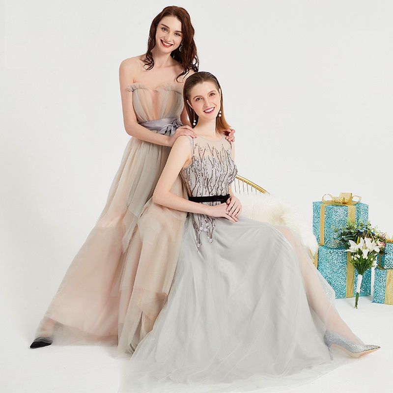
Soft focus
The website features soft-focus photography, often with a shallow depth of field, creating a dreamy and romantic aesthetic.
More brands in Fashion
Explore other brands in this industry to compare visual identities.