Rodinné a komunitní centrum PALEČEK
The EverymanServes Families with young children in Prague 3
What Drives Them
Relatable and down-to-earth. Connects through belonging.
Color Intelligence
Rodinné a komunitní centrum PALEČEK anchors on a vivid Orange (#f27d02) as their primary brand signal, paired with Blue (#014673), and accented by Blue. The palette leans cool — projecting trust and professionalism.
#f27d02
Primary
#014673
Secondary
#878886
Background
#8bd1df
Accent
#5dc4d2
Accent
#416477
Accent
Typography
Headings set in Montserrat (a sans-serif — clean, modern, and optimized for digital), body in Roboto (a sans-serif — clean, modern, and optimized for digital).
Logo Anatomy
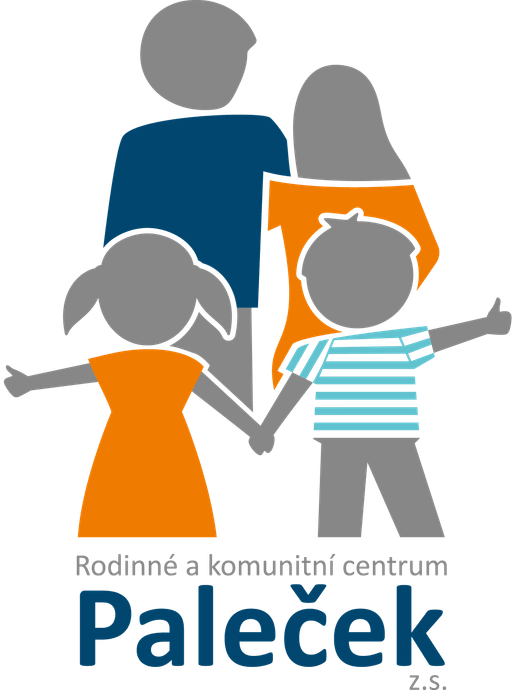
Rodinné a komunitní centrum PALEČEK uses a combination mark — pairing symbol with wordmark for versatility.
Combination Mark
Icon + Text
Brand Character
Design Playbook
Digital Footprint
.
Market Presence
Nationwide presence, based in CZ.
CZ
national
cs
Rodinné a komunitní centrum PALEČEK is a trademark of its respective owner. Bivernado is not affiliated with, endorsed by, or sponsored by Rodinné a komunitní centrum PALEČEK. All brand data shown here is collected from publicly available sources and analyzed for informational and research purposes under fair use principles. Request removal →
Logo Variants

Primary Raster
Primary LogoBrand Codes
Family Silhouette
A simple, flat silhouette of a family (father, mother, son, daughter) holding hands, used as a logo element.
Products & Business
Dětská skupina (Childcare)
Herna (Playroom)
Klub RKC Paleček (After-school club)
Kurzy pro děti (Courses for children)
Logopedická poradna (Speech therapy)
Narozeninové oslavy (Birthday parties)
Psychoterapeutická poradna (Psychotherapy)
Rodinná mediace (Family mediation)
Showing 8 of 9 products
More brands in Community Centers
Explore other brands in this industry to compare visual identities.