What Drives Them
Brings ideas to life. Values imagination and self-expression.
Color Intelligence
RP Climbing, spol. s r.o. anchors on Red (#d31f33) as their primary brand signal, paired with Blue (#dee2e6), and accented by Red. The palette leans warm — inviting and energetic.
#d31f33
Primary
#000000
Background
#231f20
Text
#ffffff
Background
#dee2e6
Secondary
#53020f
Accent
Typography
Headings set in Nudista (a sans-serif — clean, modern, and optimized for digital), body in SFMono-Regular (a monospace — technical and precise, common in code-first brands).
Logo Anatomy
RP Climbing, spol. s r.o. uses a combination mark — pairing symbol with wordmark for versatility.
Combination Mark
Icon + Text
Brand Character
RP Climbing, spol. s r.o. is authoritative and decisive, energetic and passionate.
third
high_school
direct
Signature Words
Design Playbook
Digital Footprint
active on 3 social platforms.
Market Presence
Global presence, based in CZ, communicating in 3 languages.
CZ
global
en, cs, de
RP Climbing, spol. s r.o. is a trademark of its respective owner. Bivernado is not affiliated with, endorsed by, or sponsored by RP Climbing, spol. s r.o.. All brand data shown here is collected from publicly available sources and analyzed for informational and research purposes under fair use principles. Request removal →
Logo Variants
Primary Raster
Primary LogoBrand Codes
Engineering for Climbing
Tagline emphasizing technical expertise.
RP Red
#d31f33 used prominently in the logo and website design.
Nudista
Modern and bold font used for headings.
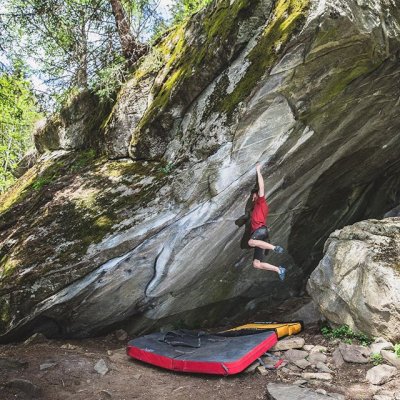
Action Climbing
The photography style captures climbers in dynamic action, often mid-move, emphasizing the challenge and athleticism of bouldering.
Social Media Intelligence
More brands in Sports Equipment
Explore other brands in this industry to compare visual identities.