Sex Machines Museum
The OutlawServes Adults interested in history and sexuality
What Drives Them
Challenges the status quo. Breaks rules to build better ones.
Color Intelligence
Sex Machines Museum anchors on a muted Red (#dfd0d2) as their primary brand signal, paired with Red (#bc051c), and accented by Red. The palette leans warm — inviting and energetic.
#dfd0d2
Primary
#bc051c
Secondary
#ca394b
Accent
#c62338
Accent
#585858
Accent
#a9787f
Accent
Typography
Single-font system — disciplined and consistent.
Logo Anatomy
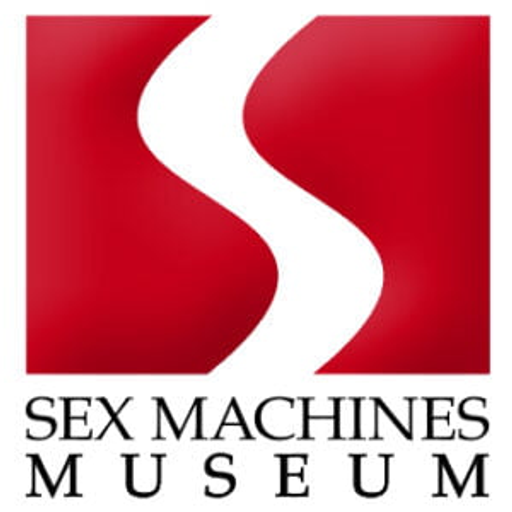
Sex Machines Museum uses a combination mark — pairing symbol with wordmark for versatility. Moderate detail — balancing distinctiveness with versatility. Style: retro, vintage, bold.
Combination Mark
rectangle
Icon + Text
6/10
Brand Character
Sex Machines Museum is authoritative and decisive, energetic and passionate, simply spoken and accessible.
third
middle_school
playful
Signature Words
Design Playbook
historical, documentary
natural
full_color
flat
horizontal
rounded
comfortable
image_carousel
Digital Footprint
Built on WordPress.
Market Presence
Global presence, headquartered in Prague, CZ, communicating in 5 languages.
CZ
Prague, CZ
global
en, de, cs, it, ru
Sex Machines Museum is a trademark of its respective owner. Bivernado is not affiliated with, endorsed by, or sponsored by Sex Machines Museum. All brand data shown here is collected from publicly available sources and analyzed for informational and research purposes under fair use principles. Request removal →
Logo Variants
Primary Raster
Primary LogoPrimary shape: rectangle
Brand Codes
Courier New
Typewriter-style font, giving a vintage and slightly edgy feel.
Discover the famous Sex Machines Museum of Prague
Tagline promoting the museum's unique collection.
S shape
A white, stylized 'S' shape is prominently featured in the logo, set against a red square.
More brands in Museum
Explore other brands in this industry to compare visual identities.