What Drives Them
Values simplicity and honesty. Trusted for being genuine.
Color Intelligence
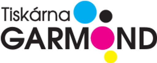
GARMOND anchors on a vivid Pink (#ec038d) as their primary brand signal, paired with Yellow (#fff20b), and accented by Blue. The palette leans warm — inviting and energetic.
#ec038d
Primary
#fff20b
Secondary
#05afef
Accent
#cfb3cb
Accent
#262223
Text
#fcfdfd
Background
Typography
GARMOND uses Poppins across both headings and body — a sans-serif — clean, modern, and optimized for digital. Single-font system — disciplined and consistent.
Logo Anatomy
Brand Character
GARMOND is authoritative and decisive.
first_plural
high_school
direct
Signature Words
Design Playbook
product photography, industrial
natural
full_color
flat
top_navigation
rounded
balanced
full-screen
Digital Footprint
Built on WordPress.
Market Presence
Regional presence, headquartered in Dalovice, CZ, communicating in 2 languages.
CZ
Dalovice, CZ
regional
cs, de
GARMOND is a trademark of its respective owner. Bivernado is not affiliated with, endorsed by, or sponsored by GARMOND. All brand data shown here is collected from publicly available sources and analyzed for informational and research purposes under fair use principles. Request removal →
Brand Codes
Bright Pink Accent
The bright pink (#ec008c) is used for buttons and links, creating a modern and eye-catching accent.
Founded in 1992
The website highlights the company's founding year, emphasizing its long-standing tradition and experience.
"Tiskneme jako když lžeme"
The tagline "Tiskneme jako když lžeme" (We print like we lie) is prominently displayed, creating a memorable and slightly humorous brand message.
More brands in Printing
Explore other brands in this industry to compare visual identities.