XAUTODÍLY
The CaregiverServes Car owners seeking maintenance, repair, and detailing services.
What Drives Them
Puts people first. Builds trust through genuine care.
The brand offers a wide range of services, from sales and imports to repairs, detailing, and diagnostics, all under one roof. This 'one-stop-shop' approach for all automotive needs is a key differentiator.
Color Intelligence
XAUTODÍLY anchors on a vivid Red (#f01c25) as their primary brand signal, paired with Red (#ff0000), and accented by Pink. The palette leans warm — inviting and energetic.
#f01c25
Primary
#ff0000
Secondary
#ffffff
Background
#b20031
Accent
#000000
Background
#cf2e2e
Accent
Typography
Headings set in Roboto Slab (a slab serif — bold and impactful, blending tradition with modern punch), body in Open Sans (a sans-serif — clean, modern, and optimized for digital). 4 typeface families in play — a richer, more layered typographic system.
Logo Anatomy
XAUTODÍLY uses a combination mark — pairing symbol with wordmark for versatility.
Combination Mark
Icon + Text
Brand Character
XAUTODÍLY is authoritative and decisive, warm and approachable, energetic and passionate.
first_plural
high_school
direct
Signature Words
Design Playbook
product photography, action shots
natural
full_color
flat
horizontal
rounded
comfortable
image_carousel
Digital Footprint
Built on WordPress, active on 2 social platforms.
Market Presence
Local market, headquartered in Černožice, CZ.
CZ
Černožice, CZ
local
cs
XAUTODÍLY is a trademark of its respective owner. Bivernado is not affiliated with, endorsed by, or sponsored by XAUTODÍLY. All brand data shown here is collected from publicly available sources and analyzed for informational and research purposes under fair use principles. Request removal →
Logo Variants
Primary Raster
Primary LogoBrand Codes
Tomicars Orange
The brand uses a distinctive orange shade (#ff4311) consistently in its logo, buttons, and accents.
Czech Location
The brand emphasizes its location in Černožice, Czech Republic.
Service Focus
The brand name 'Tomicars' suggests a focus on cars and related services.
Vše pro vaše auto na jednom místě
The tagline 'Vše pro vaše auto na jednom místě' (Everything for your car in one place) is prominently displayed.
Geometric Font
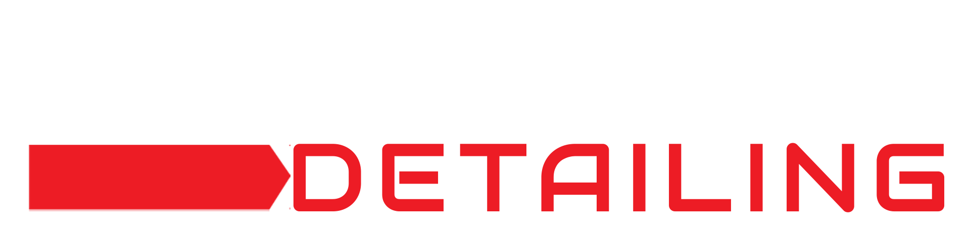
The logo uses a bold, geometric sans-serif font with rounded corners for the word "TOMICARS" and a similar but slightly different font for "DETAILING".
Red Arrow
A red rectangle with an arrow shape cut out of the right side is used as a visual element in the logo.
Products & Business
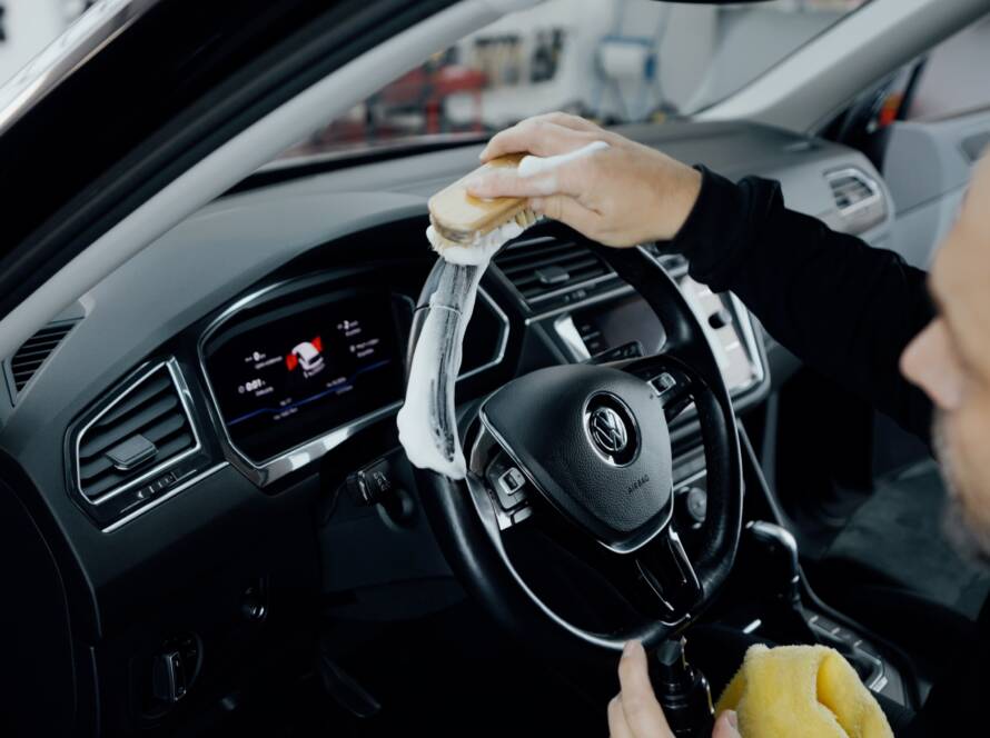

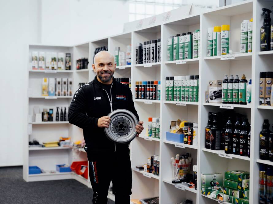
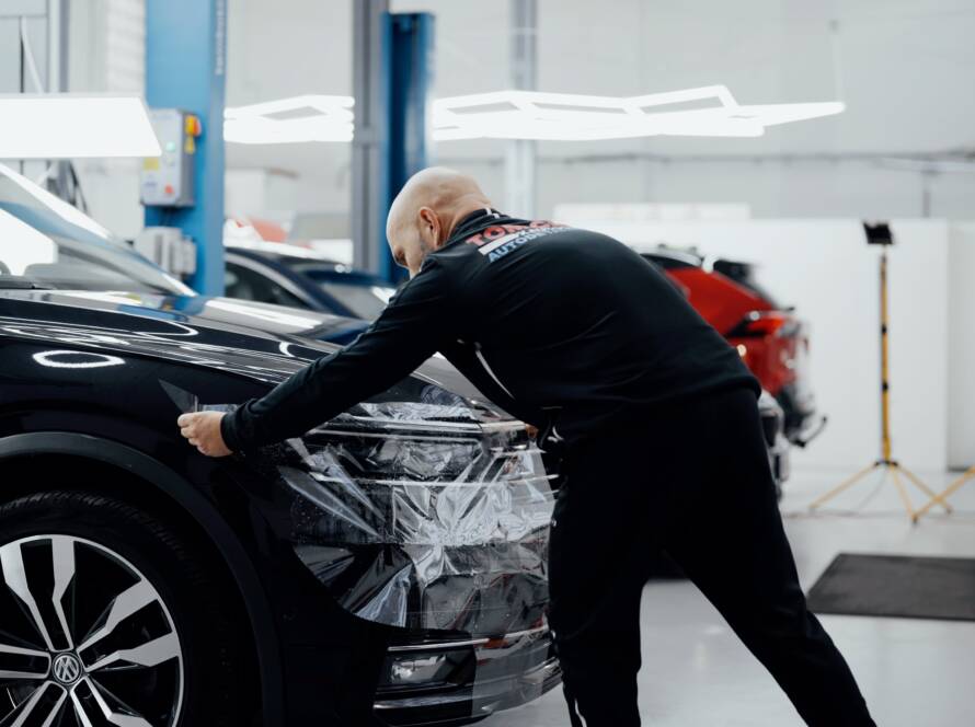
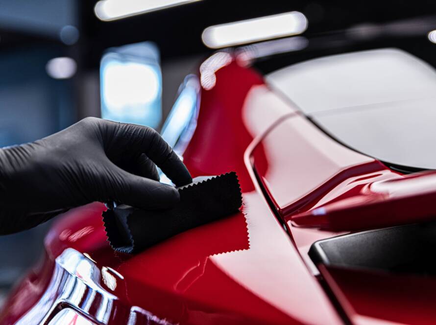
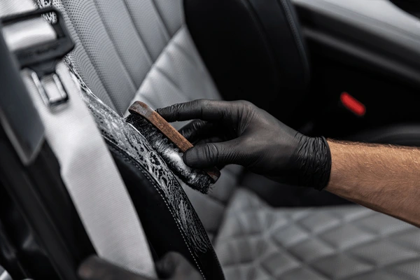
Showing 8 of 11 product images
More brands in Automotive
Explore other brands in this industry to compare visual identities.