Ubytování Rtyně v Podkrkonoší
Serves Tourists visiting the Krkonoše region
Color Intelligence
Ubytování Rtyně v Podkrkonoší anchors on Green (#369640) as their primary brand signal, paired with Blue (#010299), and accented by Green. The palette leans cool — projecting trust and professionalism.
#369640
Primary
#010299
Secondary
#089f4f
Accent
#fbdd02
Accent
#a1b126
Accent
#a3d841
Accent
Typography
Logo Anatomy
Ubytování Rtyně v Podkrkonoší uses a combination mark — pairing symbol with wordmark for versatility.
Combination Mark
Icon + Text
Brand Character
Design Playbook
Digital Footprint
.
Market Presence
Nationwide presence, based in CZ.
CZ
national
cs
Ubytování Rtyně v Podkrkonoší is a trademark of its respective owner. Bivernado is not affiliated with, endorsed by, or sponsored by Ubytování Rtyně v Podkrkonoší. All brand data shown here is collected from publicly available sources and analyzed for informational and research purposes under fair use principles. Request removal →
Logo Variants

Primary Raster
Primary LogoBrand Codes
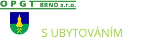
Coat of Arms
A coat of arms featuring a tower and mining symbols, representing the region's history.
Products & Business
More brands in Travel & Tourism
Explore other brands in this industry to compare visual identities.