Vodohospodářský atelier
The RulerServes municipalities, construction companies
What Drives Them
Organized and dependable. Creates order and stability.
The brand emphasizes expertise, quality, and a professional personality. The contact information and copyright date on the homepage further reinforce a sense of stability and dependability, pointing to reliability as the core 'ness'.
Color Intelligence
Vodohospodářský atelier anchors on a vivid Blue (#005e73) as their primary brand signal, paired with Blue (#00a7e4), and accented by Blue. The palette leans cool — projecting trust and professionalism.
#005e73
Primary
#00a7e4
Secondary
#0088b9
Accent
#00fefe
Accent
#5b5d38
Accent
#797454
Accent
Typography
Logo Anatomy
Vodohospodářský atelier uses a combination mark — pairing symbol with wordmark for versatility.
Combination Mark
Icon + Text
Brand Character
Design Playbook
Digital Footprint
.
Market Presence
Nationwide presence, based in CZ.
CZ
national
cs
Vodohospodářský atelier is a trademark of its respective owner. Bivernado is not affiliated with, endorsed by, or sponsored by Vodohospodářský atelier. All brand data shown here is collected from publicly available sources and analyzed for informational and research purposes under fair use principles. Request removal →
Logo Variants

Primary Raster
Primary LogoProducts & Business


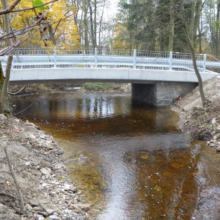


Showing 8 of 12 product images
Engineering Structures
Flood Protection Measures
Pond and Reservoir Design
Sewerage Systems
Wastewater Treatment Plants
Water Management Solutions
More brands in engineering
Explore other brands in this industry to compare visual identities.