
Ševela - Vodo | Topo | Plyn
The Ruler“Váš partner v oblasti VODO - TOPO - PLYN”
Serves Homeowners and businesses in the Hovorany region needing plumbing, heating, or gas services.
What Drives Them
Organized and dependable. Creates order and stability.
Ševela emphasizes expertise, quality, and being a local partner. These attributes converge to project an image of dependability and trustworthiness in their service area, making 'Reliability' their core -ness.
Color Intelligence
Ševela - Vodo | Topo | Plyn anchors on a vivid Blue (#00769b) as their primary brand signal, paired with Blue (#bddbe5), and accented by Blue. The palette balances warm and cool tones.
#00769b
Primary
#bddbe5
Secondary
#4199b5
Accent
#ffffff
Background
#000000
Background
#fff3cd
Accent
Typography
Logo Anatomy
Ševela - Vodo | Topo | Plyn uses a combination mark — pairing symbol with wordmark for versatility.
Combination Mark
Icon + Text
Brand Character
Design Playbook
Digital Footprint
.
Market Presence
Nationwide presence, based in CZ.
CZ
national
cs
Ševela - Vodo | Topo | Plyn is a trademark of its respective owner. Bivernado is not affiliated with, endorsed by, or sponsored by Ševela - Vodo | Topo | Plyn. All brand data shown here is collected from publicly available sources and analyzed for informational and research purposes under fair use principles. Request removal →
Logo Variants

Primary Raster
Primary LogoBrand Codes
Abstract S shape
The logo features an abstract 'S' shape, resembling a pipe fitting or a stylized water droplet, enclosed within a geometric shape.
Ševela typeface
The brand name 'Ševela' is written in a specific sans-serif typeface, with a distinctive 'Š' character.
Products & Business
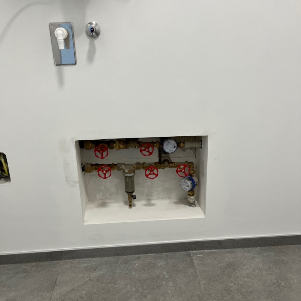




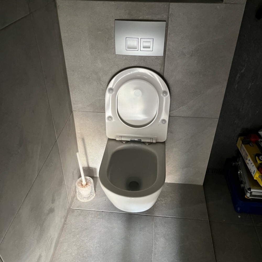

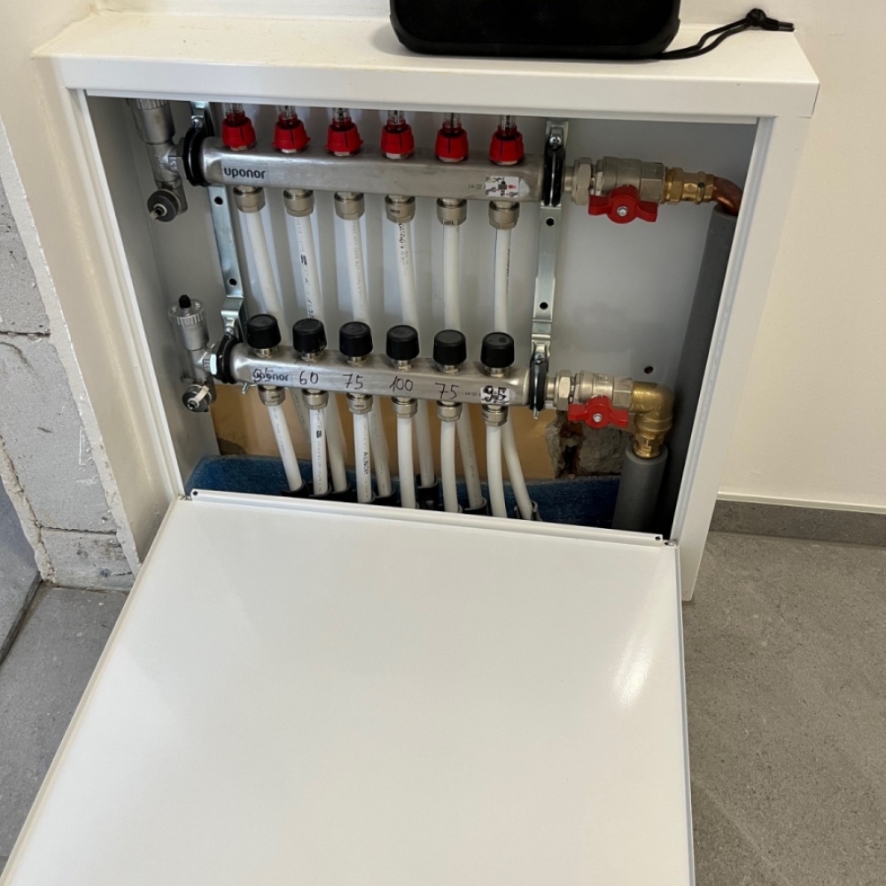
Showing 8 of 12 product images
Instalace FVE
Izolace
Koupelny
Plynoinstalace
Topenářství
Udržba FVE
Vodoinstalace
More brands in Construction
Explore other brands in this industry to compare visual identities.


